Success (´・ᴗ・ ` ) Request received
We’ll review your input and get back to you to align on the next step.
Back to Site
e-mail:
sales@moses.agency
Error. Couldn’t send.
Please check and try again. ~(>_<~)
Please check and try again. ~(>_<~)
We design brands as complete systems — built to scale, easy to use, and impossible to ignore. From naming and identity to motion, 3D, and AI, every element works as one clear language that builds recognition, emotional connection, and long-term positioning.
We Design Bold Brand Systems Built around Human Psychology
Naming
Brand Tagline
Brand Legend
Logotype
Visual Identity
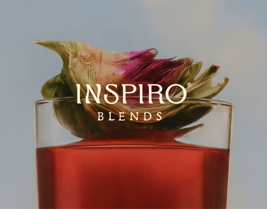
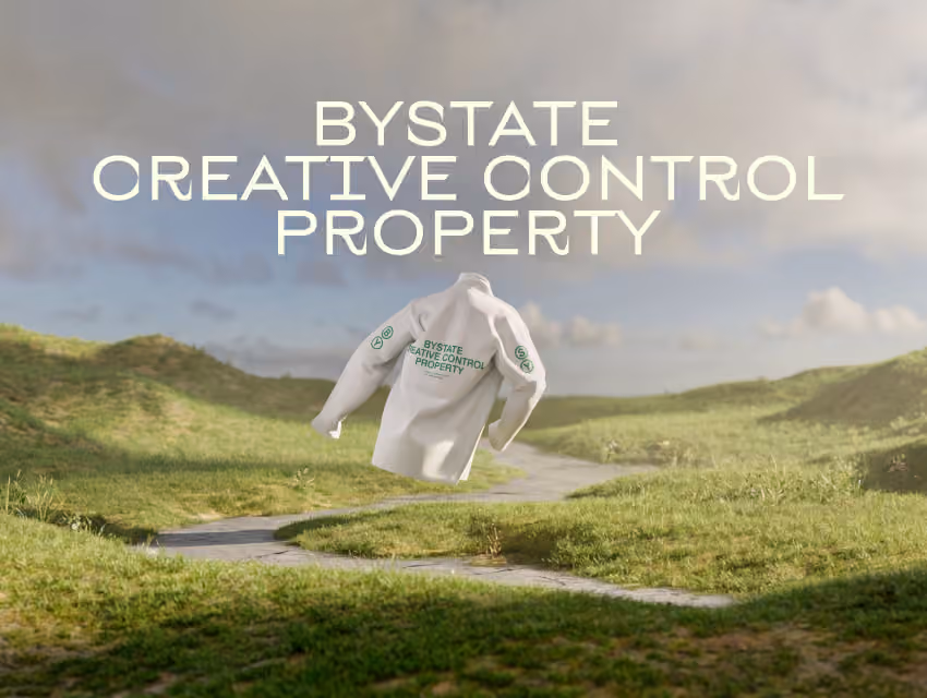
Packaging Design
Typeface Design
Illustrations
CGI & 3D
Brand Books & Guidelines
Spatial Design
Start Your Project

Visionary Concepts
Creating Cultural Gravity Around Brands
We build highly functional concepts rooted entirely in deep human psychology—knowing exactly what people crave. It’s the powerful, positive propaganda of your core values.
Visual Identity
High-Impact Visual Identity
We engineer highly functional design built to pull the exact right emotional strings. It commands absolute attention and sweeps top-tier awards across the global design community.
Visionary Concepts
Complex Systems, Clear Execution
From custom typography and immersive 3D to advanced AI visuals and motion systems — we execute bold concepts at any scale while maintaining absolute visual precision.
Brand Guidelines
The Bulletproof Brandbook
We deliver guidelines of any complexity and depth so your team never has to guess. We pack our insane visual concepts into a highly structured system that makes integrating and scaling your new style completely effortless
500+
Global projects engineered. We build functional identities that actually solve business problems
17
Countries dominated. We map local cultural codes to integrate your brand into the audience's daily life
0→1
From custom typography to 3D, is built from scratch to pull the exact right emotional strings
∞
Endless consistency. God-tier brandbook designed for completely effortless integration by your team
Built Step by Step

5 days
Brand Naming
Names built on strategy, sound, and scalability. Designed to work across markets and hold long-term relevance.
Learn more
Close It
Brand Naming
5 days
A name is the first point of contact with a brand. It should be simple enough to remember, precise enough to avoid randomness, and strong enough to scale with the brand.
The process is built on the brief, strategy, and audience understanding. At this stage, we define the nature of the name: direct or metaphorical, local or universal, neutral or expressive.We then develop several directions, each with a curated set of 7–20 options. Every name comes with a rationale — meaning, phonetics, and communication potential.
Final options undergo initial checks: domain availability, social handles, category overlaps, and basic registrability.
The result is a name that fits the strategy, resonates with the audience, and holds its meaning as the brand grows.
Talk to an Expert
Submit the Brief

3 to 7 days
Brand Tagline (Slogan)
Short-form messaging that captures the core idea of the brand. Focused, memorable, and aligned with positioning.
Learn more
Close It
Brand Tagline (Slogan)
3 to 7 days
A phrase at the core — built to endure repetition without losing strength. It can act as a brand signature, the voice of a campaign, or a concise way to express why the brand exists.
Beyond meaning and phrasing, we focus on behavior: how it sounds aloud, how it sits in layout, how easily it’s remembered, and how well it works next to the logo, in ads, on packaging, across the website, or in product launches.
We search for a formula where idea, tone, and communication intent converge. Sometimes the line is direct and explanatory. Sometimes it’s emotional, cultural, bold — or almost invisible, yet shaping perception.
The result is a concise line with a clear role: it strengthens the brand, differentiates it, and brings focus to communication.
Talk to an Expert
Submit the Brief
7 days
Brand Story (Legend)
A coherent story that gives the brand depth and meaning. Frames its origin, intent, and perspective.
Learn more
Close It
Brand Story (Legend)
7 days
A narrative that gives the brand depth: where it comes from, what it believes in, why it speaks the way it does, and the place it aims to occupy in people’s lives.
It can be rooted in the project’s origin, the founder’s personality, cultural context, product logic, or a constructed world around the brand. What matters is that it doesn’t feel decorative — it should reinforce meaning and help the audience quickly sense the brand’s character. In some cases it reads almost documentary; in others, more mythic, atmospheric, or cinematic.
The result is a coherent story that can be used across the website, presentations, brandbook, packaging, PR materials, and communication. It makes the brand more alive, memorable, and emotionally precise.
Talk to an Expert
Submit the Brief
7 to 20 days
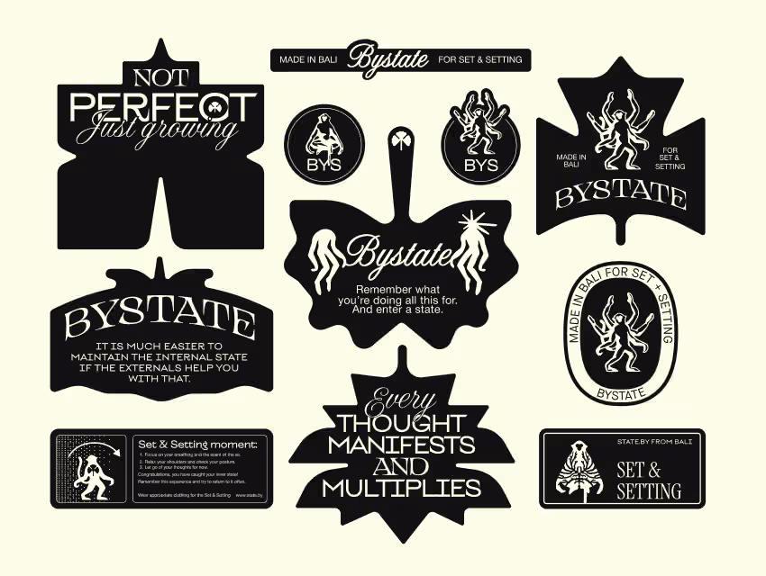
Logos
Distinctive marks shaped by the brand’s character. Designed for recognition and flexibility across formats.
Learn more
Close It
Logos
7 to 20 days
A logo is where the brand compresses into a single form. It should read instantly, hold character, and retain strength at any scale.
Before designing, we break the brand down as a system: meaning, positioning, behavior, and the visual field of the category. We define what the form needs to be — rigid or soft, strict or expressive, technological or tactile, quiet or bold.
Based on this, we develop 2–3 logo concepts. Each tests a distinct visual hypothesis — through symbol, typography, icon, or a more complex graphic metaphor. This reveals which expression translates the brand most precisely into form.
We also test how the logo performs in real contexts: small sizes, packaging, website, signage, presentations, motion, and digital environments. The mark must stay recognizable, hold together in detail, and integrate seamlessly into the broader identity.
The result is a strong trademark that conveys the brand idea, stands out from category noise, and can grow into a lasting brand asset.
Talk to an Expert
Submit the Brief
from 14 days
Visual Identity
A unified system of colors, typography, and graphic elements. Ensures consistency across all touchpoints.
Learn more
Close It
Visual Identity
from 14 days
This is the moment when the brand gets its appearance.
We start with tone. We treat the brand as a living presence: how it moves, how loud or restrained it is, whether it feels strict, sensual, bold, calm, or even strange. This helps avoid random aesthetics and build a visual language with a clear, unified character.
Then strategy takes form. We define which visual codes shape perception: what should be understood instantly, what should be remembered, where clarity is needed, and where the brand requires emphasis, gesture, or energy.
The identity is designed as a system. It should look strong, but more importantly — work across formats: website, packaging, presentations, social media, environments, navigation, merchandise, and digital products.
Once a direction is chosen, we refine the system: color palette, typography, graphic elements, composition, photography, materials, and, if needed, motion or 3D.
The result is a cohesive visual language that makes the brand recognizable, distinct, and precise in how it feels. The system is finalized in guidelines, so it can be applied consistently and developed further.
Talk to an Expert
Submit the Brief
7 to 14 days
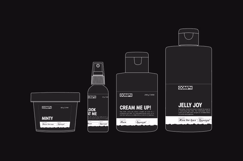
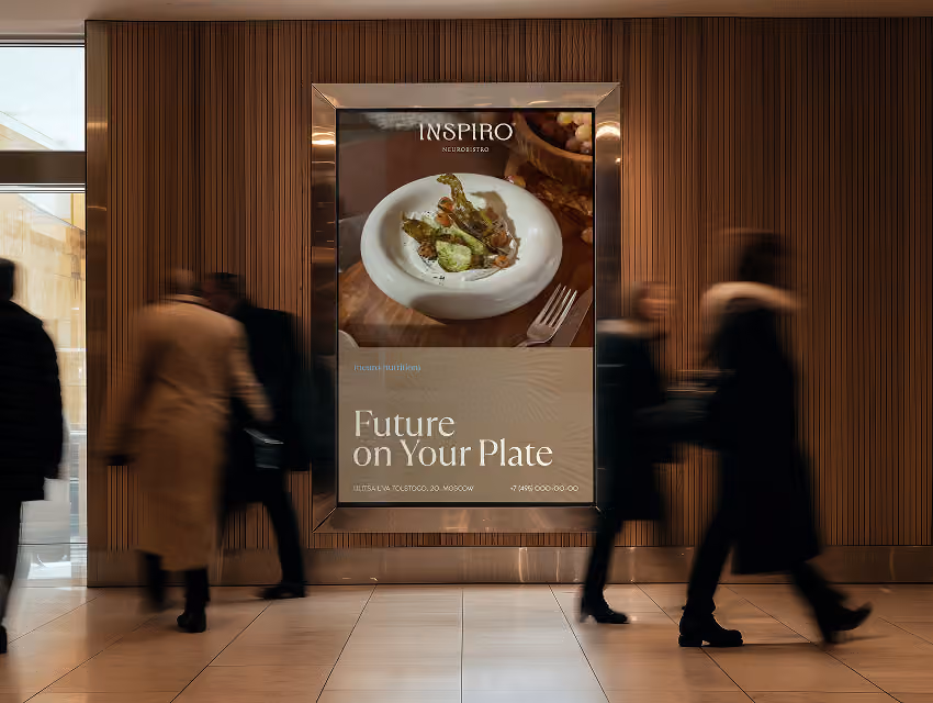
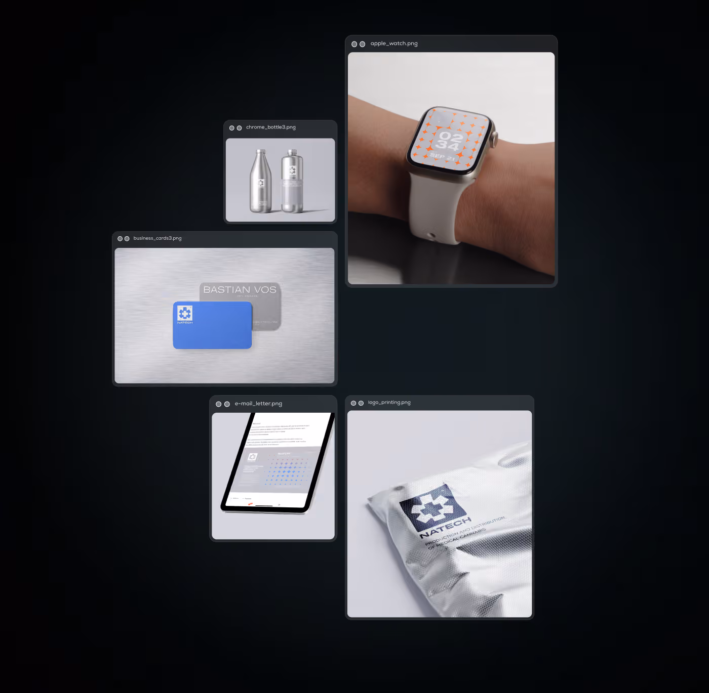
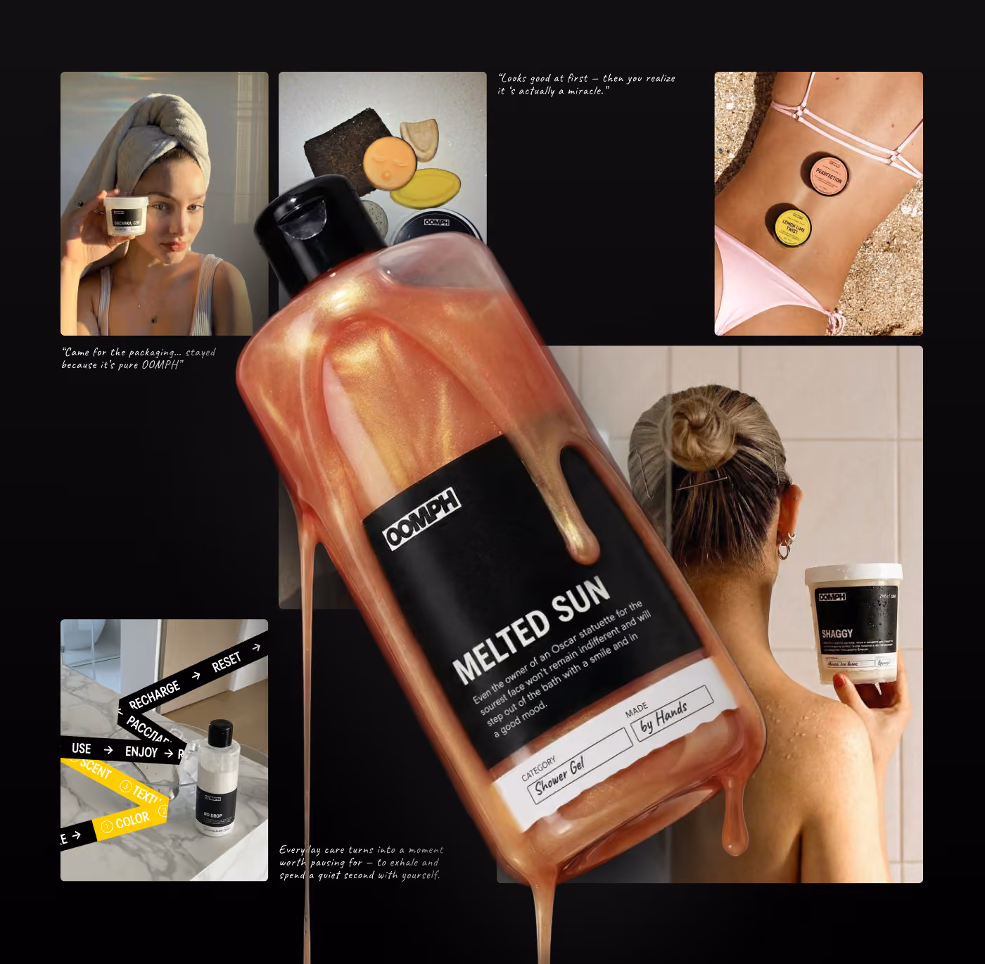
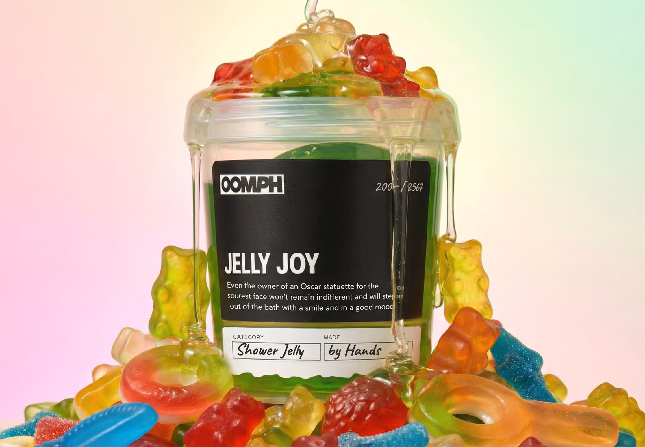
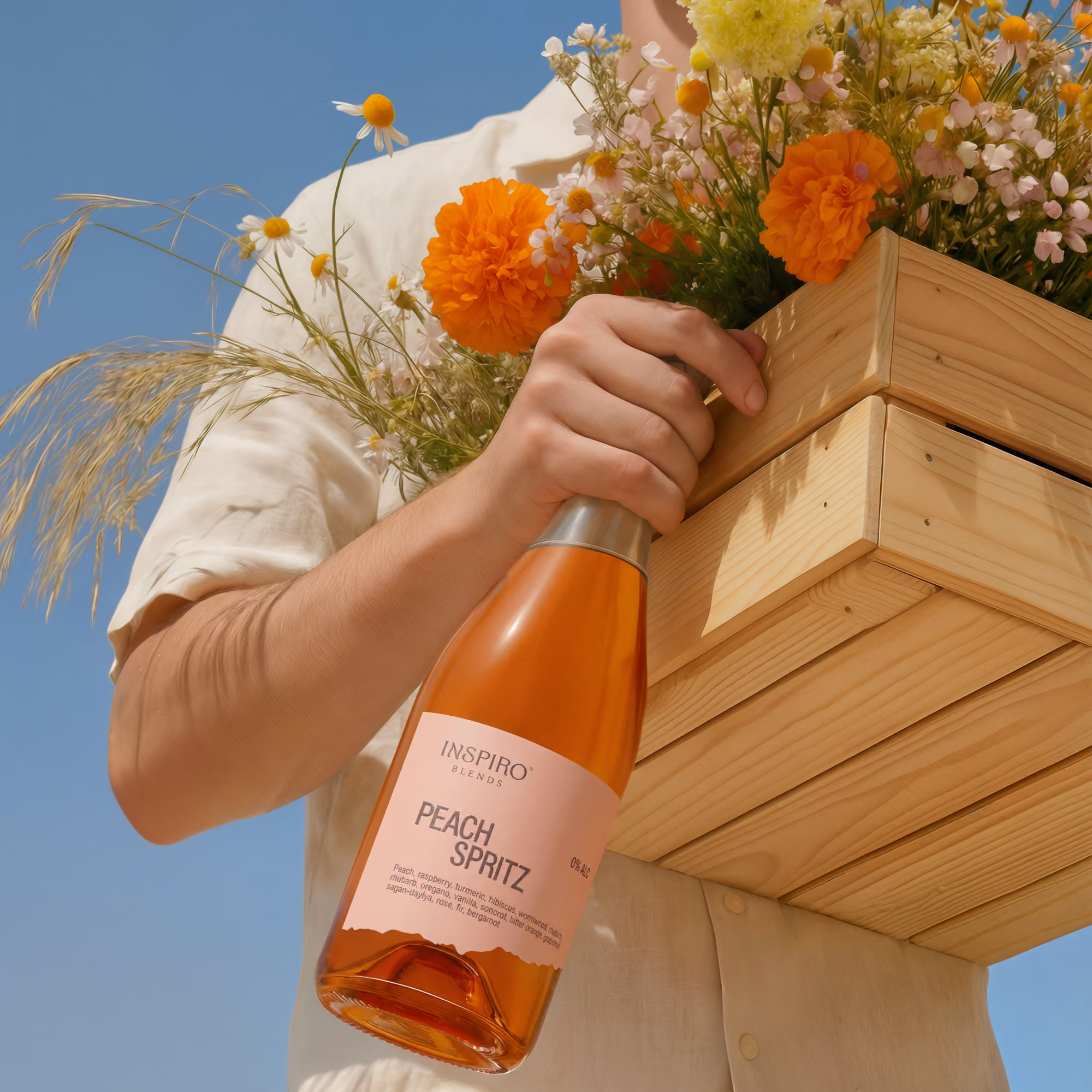
Packaging Design
Packaging as part of the product experience. Balances function, perception, and shelf impact.
Learn more
Close It
Packaging Design
7 to 14 days
This is where the brand becomes a physical object. It’s picked up, seen on the shelf, opened, kept, gifted, photographed — and this is where the visual system is tested through real interaction.
We design packaging with the category, product, buyer behavior, and sales environment in mind. It’s not just about how it looks, but how it works: whether it gets noticed, whether the product is understood instantly, whether it conveys value, and whether it stands apart from others on the shelf.
We consider form, materials, structure, color, typography, information hierarchy, labeling, SKU systems, shelf navigation, and production constraints.
Talk to an Expert
Submit the Brief
Typeface Design
Custom or adapted type systems aligned with the brand’s visual language and functional needs.
Learn more
Close It
Typeface Design
The same text can feel premium, dry, technological, naive, aggressive, or calm — simply through typeface, proportions, and rhythm.
The goal is to build a typographic system that is easy to read, practical to use, and distinct in character. We don’t just pick a “nice font.” We consider how text lives in real contexts: logo, headlines, packaging, interfaces, presentations, navigation, social media, and long-form content.
Depending on the task, we define a type system: a curated font pair, an adapted existing typeface, or custom elements — letters, numerals, accents, logotype typography, and composition rules.
Talk to an Expert
Submit the Brief
Illustrations
A tailored graphic layer that supports communication and strengthens visual identity.
Learn more
Close It
Illustrations
Not everything in a brand can be explained through photography, text, or a logo. Sometimes it needs a separate visual layer — more figurative, flexible, and free.
Illustration helps a brand explain a complex idea, add emotion, or build its own world around the product. This may include characters, graphic scenes, patterns, icons, decorative elements, technical diagrams, or art-driven graphics.
We define a style that doesn’t feel like a random image placed next to the brand, but becomes part of its language — through line, color, form, level of detail, mood, and logic of use.
Talk to an Expert
Submit the Brief
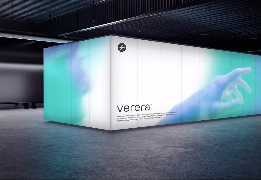
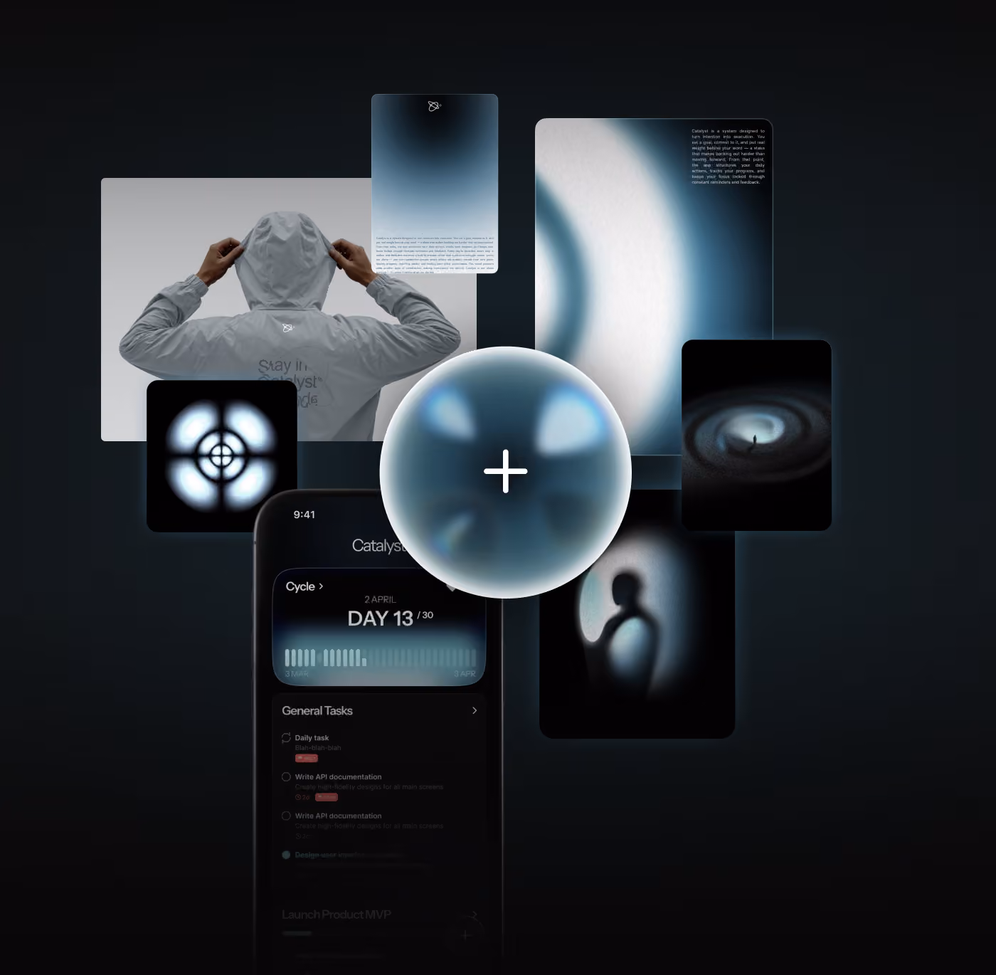
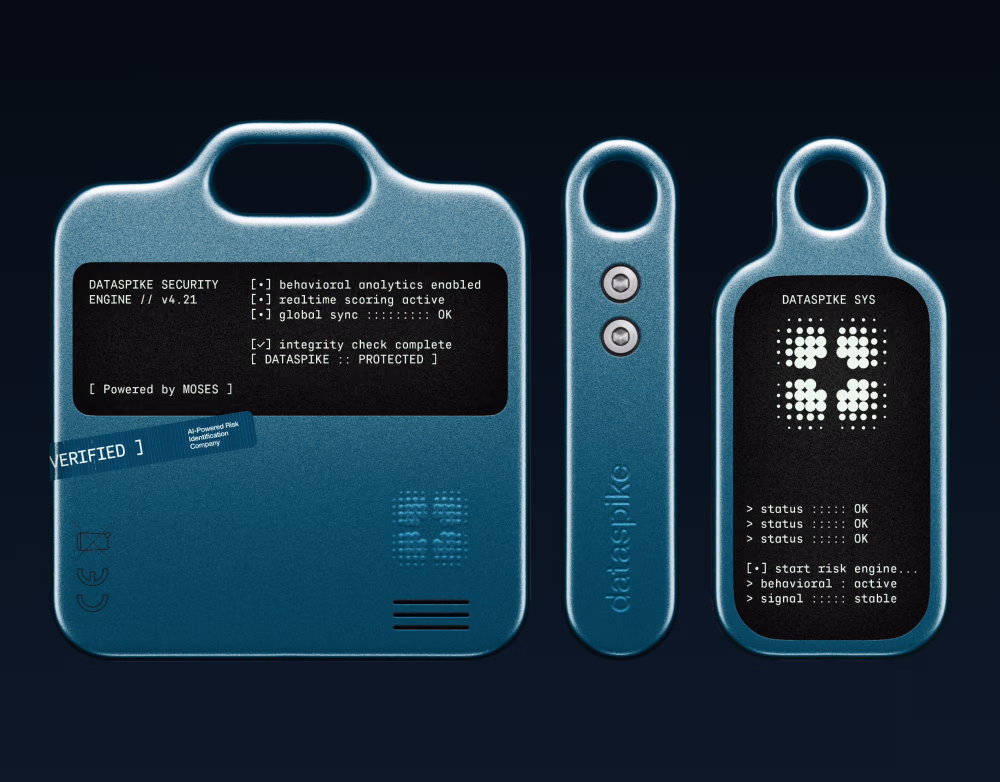
CGI & 3D
Advanced visual assets for digital environments, campaigns, and product representation.
Learn more
Close It
CGI & 3D
Some visuals are impossible — or too expensive — to produce with a camera: ideal product scenes, complex materials, abstract worlds, motion graphics, environments, and campaigns with full control over the image.
It’s not just about making something look good, but about matching the brand precisely: light, texture, scale, form, level of realism, color, composition, and how objects behave in the frame.
We create product renders, packaging visualizations, digital objects, key visuals, animation, 3D illustrations, campaign scenes, and assets for websites, presentations, social media, and advertising.
Talk to an Expert
Submit the Brief
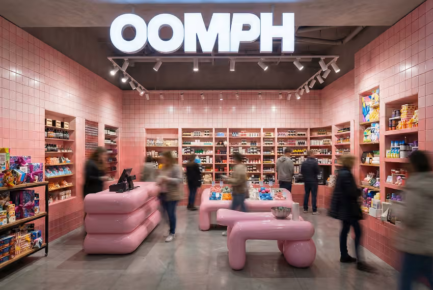
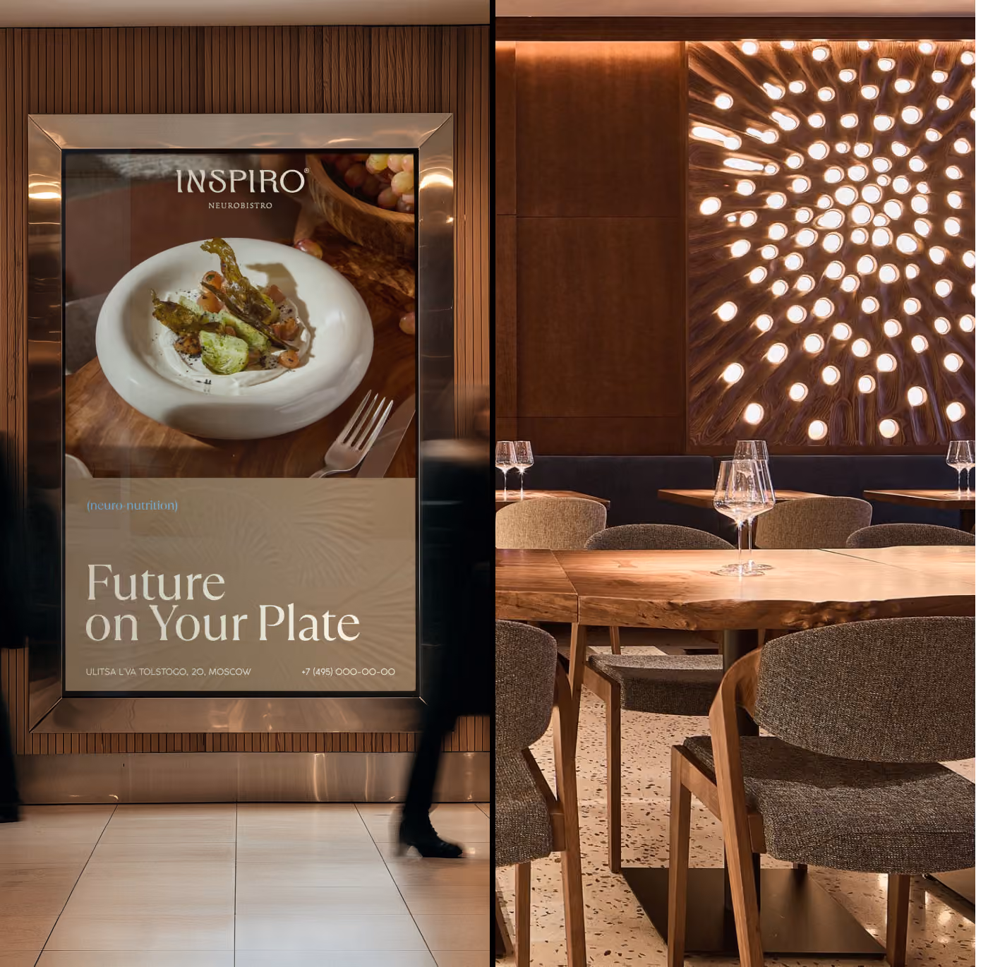
Spatial Design & Wayfinding
Branded physical environments with clear navigation and considered user flow.
Learn more
Close It
Spatial Design & Wayfinding
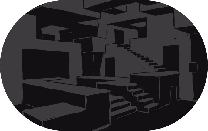
A physical space is where the brand stops being an image and becomes an experience. Scale, materials, light, graphics, displays, counters, walls, and routes shape the perception — whether it feels premium, urban, technological, intimate, or bold.
We design environments as systems: concept, zoning principles, surface graphics, storefronts, counters, fitting rooms, reception areas, pop-ups, exhibition stands, restaurants, and retail spaces.
Wayfinding is added as a functional layer — helping people understand the space, locate key areas, and move through it without friction.
A well-designed space doesn’t just “look on brand.” It drives sales, directs attention, highlights key zones, enhances the product experience, and creates a place people want to return to — or share.
Talk to an Expert
Submit the Brief
7 to 30 days
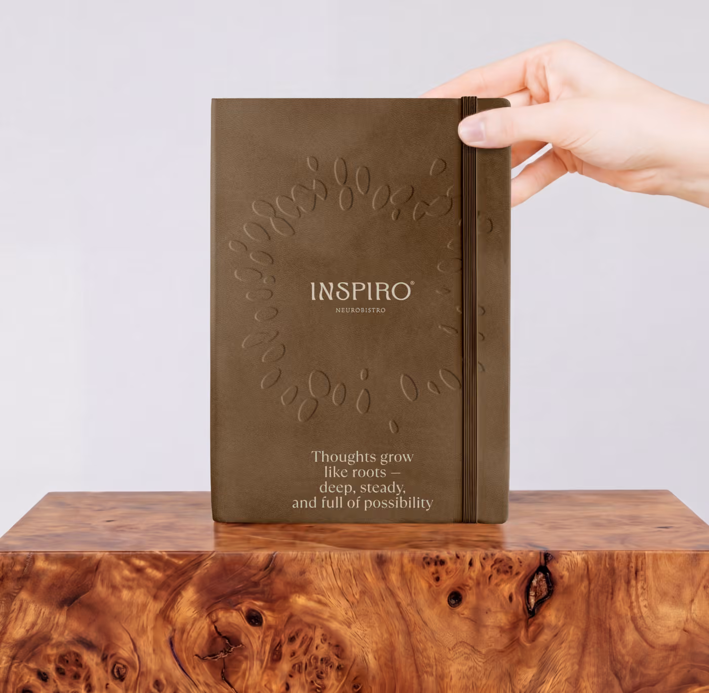
Brand Books & Guidelines
A structured system of rules and references for consistent brand application.
Learn more
Close It
Brand Books & Guidelines
7 to 30 days
A brand book ensures the brand doesn’t depend on one designer, one file, or one presentation. It defines the system: how to use the logo, colors, typography, graphics, photography, composition, packaging, digital assets, and communication.
We create not a formal document for storage, but a working tool for teams, partners, and future launches. It should clearly define what’s allowed, what isn’t, how to build new layouts, and how to keep the brand consistent across formats.
Guidelines can be compact or detailed, depending on the scale. Some brands need only core rules, others require a full system: applications, templates, tone of voice, layout principles, misuse examples, and rules for social media, presentations, packaging, environments, and digital products.
A strong brand book saves time, reduces chaos, and keeps the brand consistent — even when multiple people work with it.
Talk to an Expert
Submit the Brief