Close It

Let’s break down your idea and turn it into a clear brand that actually works

We begin with a call to identify the real problem and shape the right direction before anything is designed.
Your Name
Contact Number
By clicking the button, you agree to our privacy policy 
and the processing of your personal data.
Contact Us
Thank you! Your submission has been received!
Oops! Something went wrong while submitting the form.
Contact Us

Natech

Client
Natech Pharmaceutical
Services
  • Research
  • Branding
Country
Portugal
Year
2024
NATECH is a Portugal-based manufacturer of pharmaceutical-grade raw materials for medical cannabinoids, operating across the European market since 2022.
In this project, we were responsible for both branding and the analytical block, including preparation for entering what was then a new market for the company — Germany.
The medical cannabinoid category remains highly sensitive from both legal and ethical perspectives. Therefore, the visual identity had to deliberately distance itself from any associations with recreational cannabis culture.
NATECH’s product is pharmaceutical raw material produced in controlled laboratory conditions. The positioning is built on precision, purity, and consistency of composition.

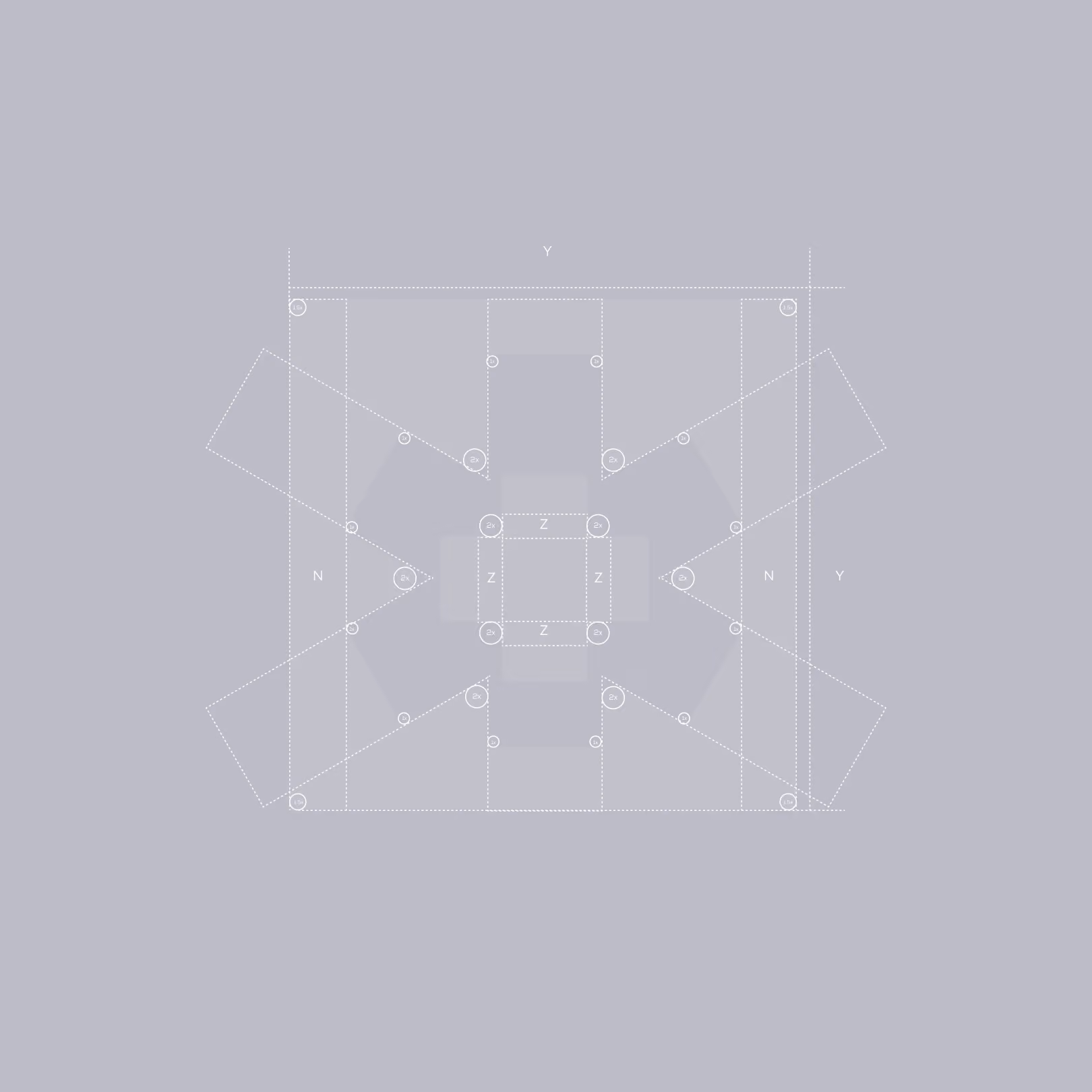
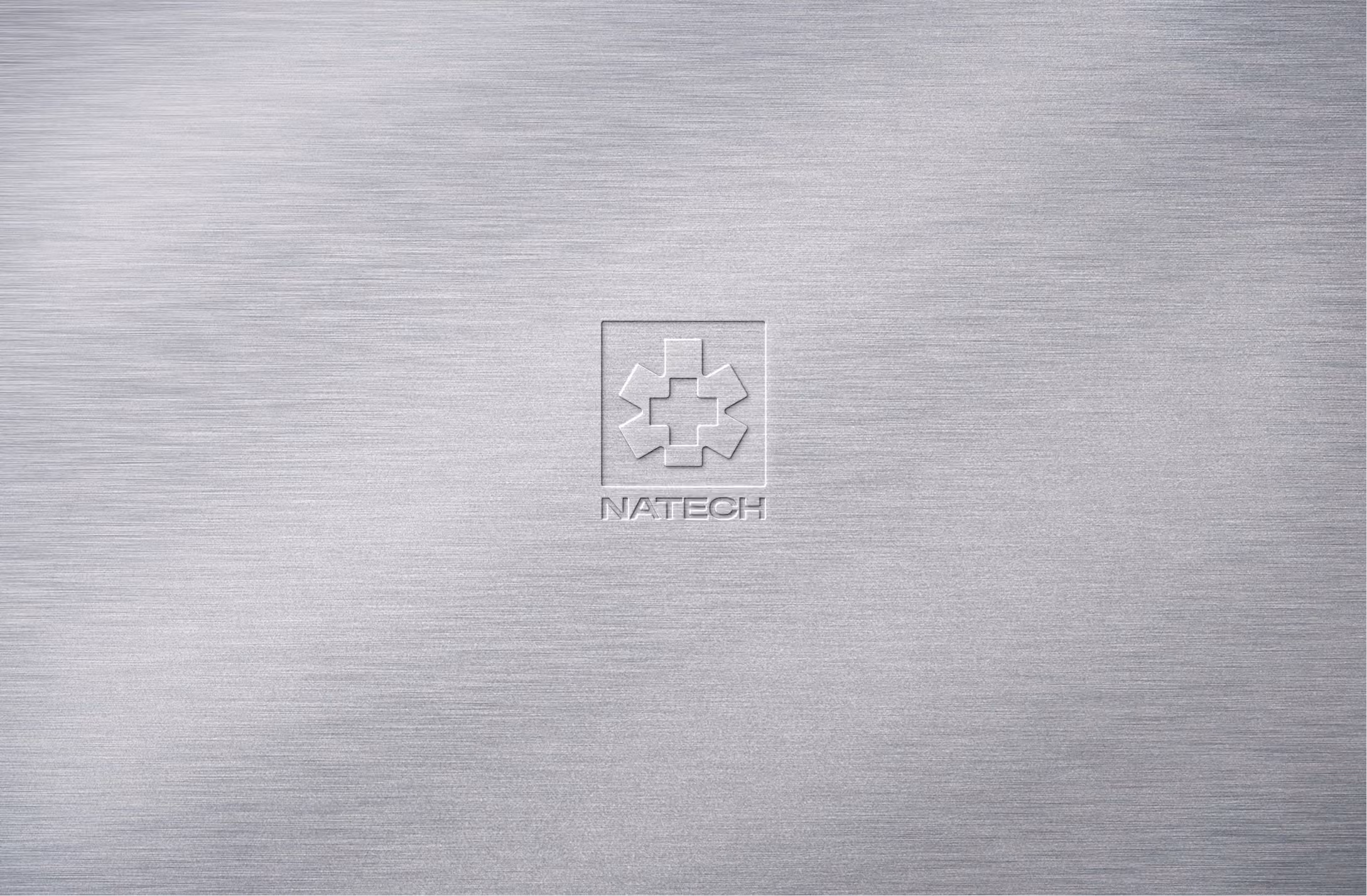
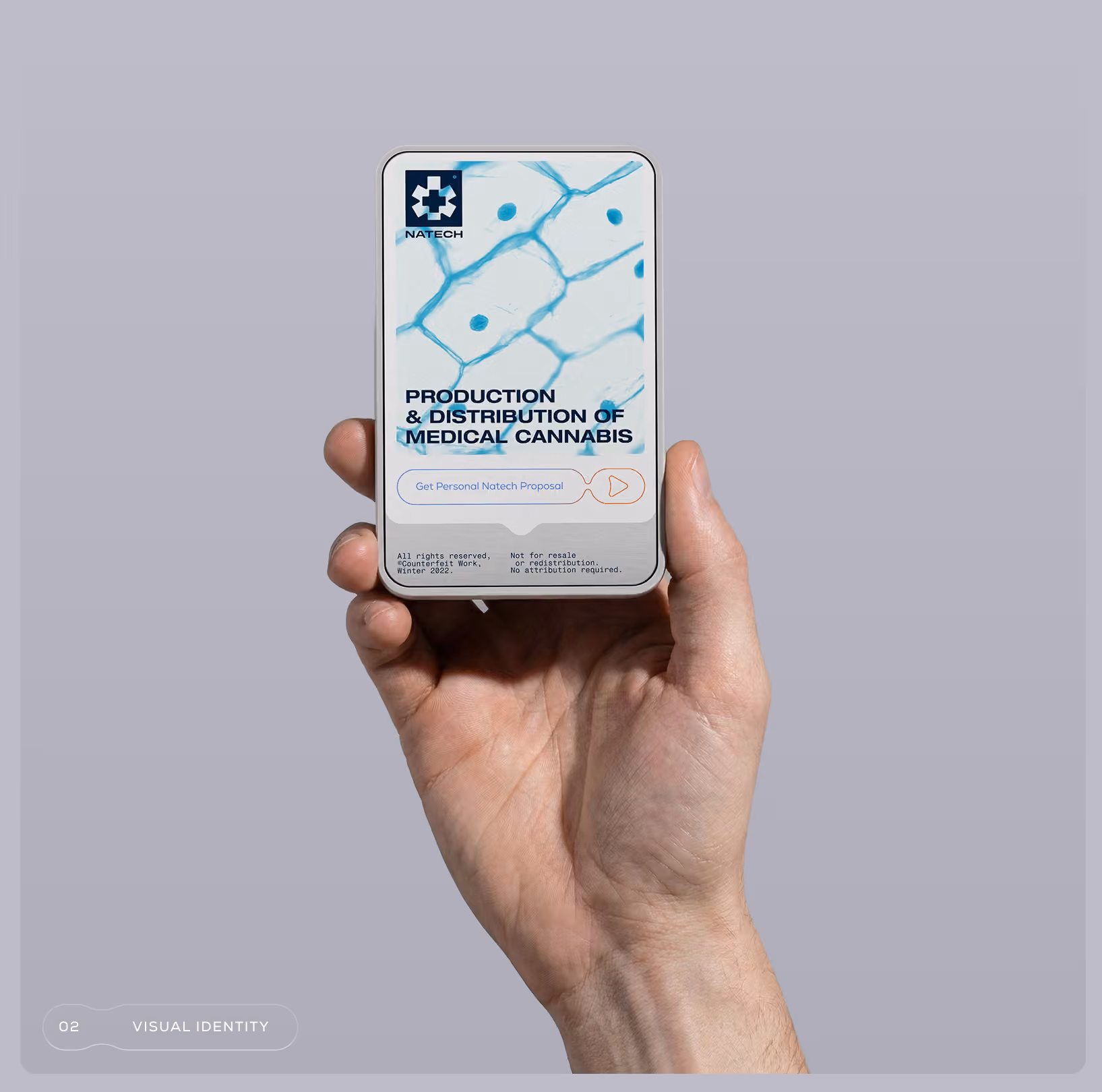
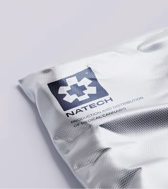
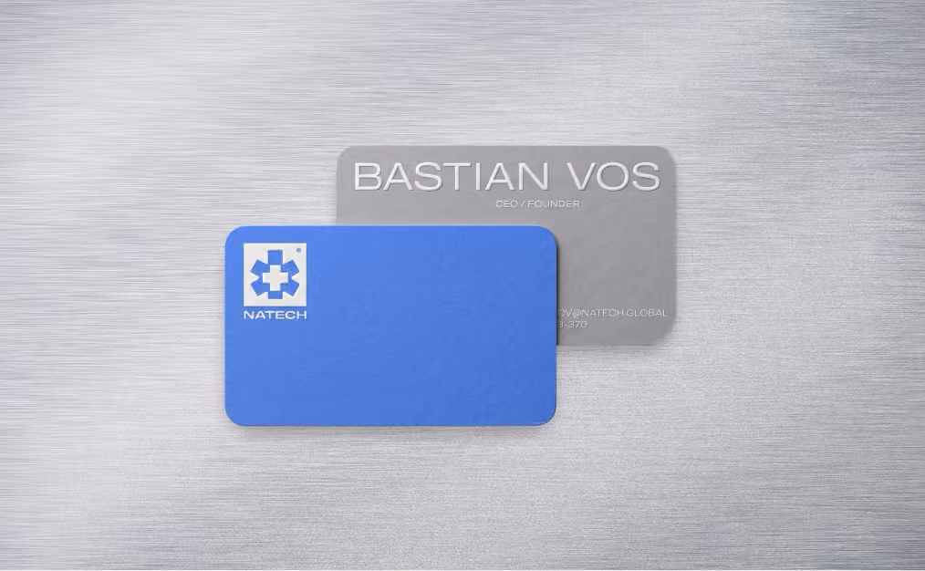
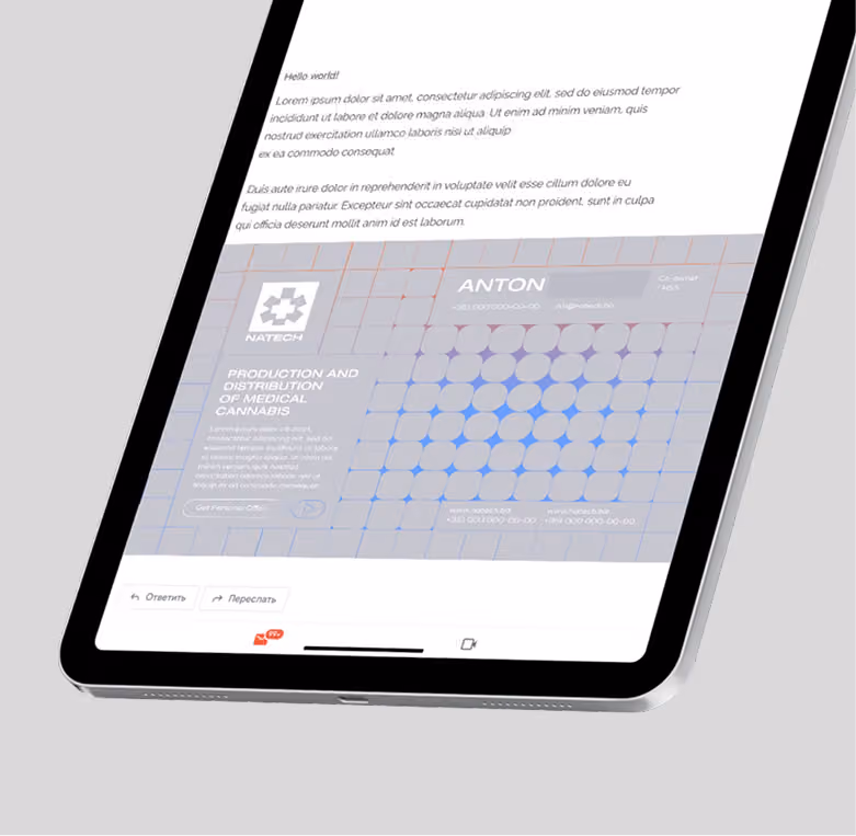
The mark is built on the structure of a medical cross, composed of two visual layers. This creates a dual reading: on the first level — pharmacology, on the second — a subtle reference to the origin.The leaf form is present, but it does not dominate or define the perception.The composition is enclosed within a square — a fundamental shape associated with control, stability, and standardization.

While the core UI wasn’t our main focus, we made light, thoughtful adaptations to ensure the branding carried through. Primary colors, key elements, and branded logic were subtly infused into the interface — so that product and brand felt like one.

A metaphor for pain losing its intensity under the effect of the treatment

This idea forms the basis of the graphic pattern. It is built as a system of sharp, rigid elements that gradually soften. The pattern should be perceived as relief —not literally, but through a shift in rhythm, form, and tension within the composition.

Beyond digital, the brand comes alive in physical spaces. Branded banners and posters across the city carry the same voice as the app: bold, emotional, and clear — even when abstract. Every piece of communication is designed to be instantly understood, whether on a screen or a street.

More