Close It

Let’s break down your idea and turn it into a clear brand that actually works

We begin with a call to identify the real problem and shape the right direction before anything is designed.
Your Name
Contact Number
By clicking the button, you agree to our privacy policy 
and the processing of your personal data.
Contact Us

Success (´・ᴗ・ ` )
Request received

We’ll review your input and get back to you to align on the next step.
Back to Site
Error. Couldn’t send.
Please check and try again. ~(>_<~)
Submit Request

Verera

Client
Dataspike US
Services
  • Branding
  • Web UI/UX Design
Country
US
Year
2025
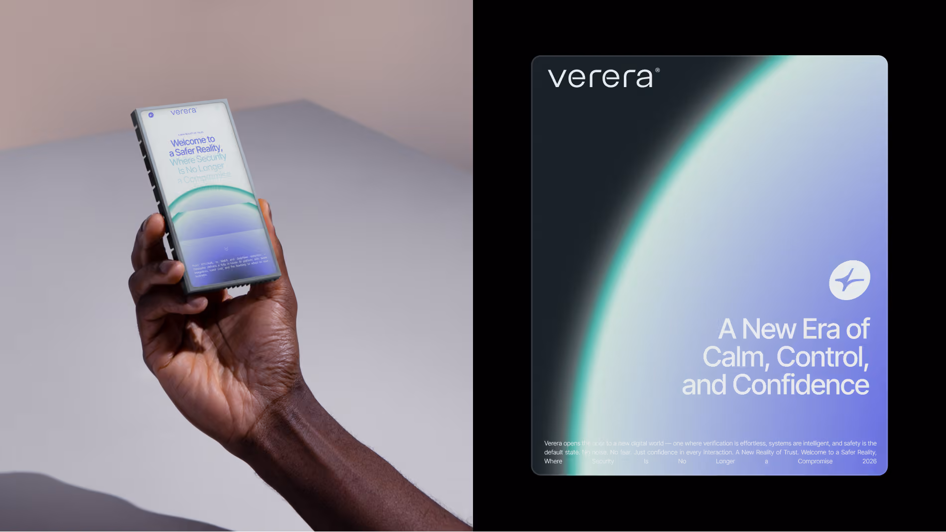
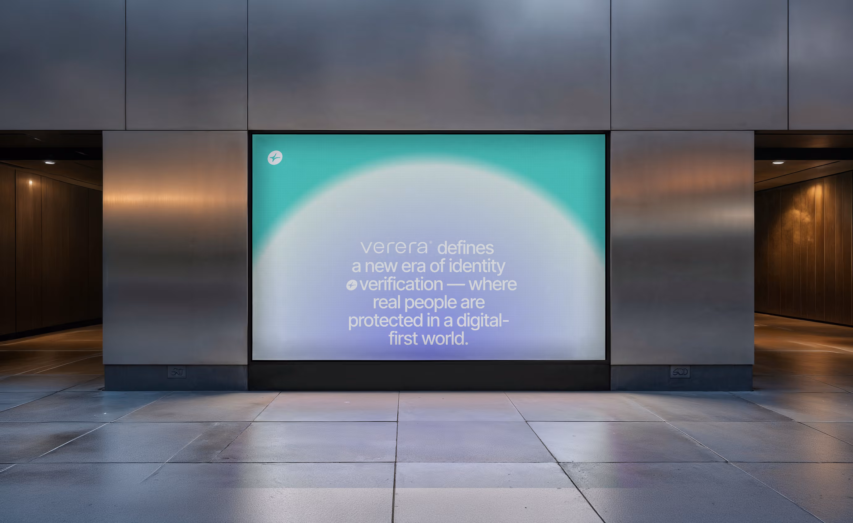
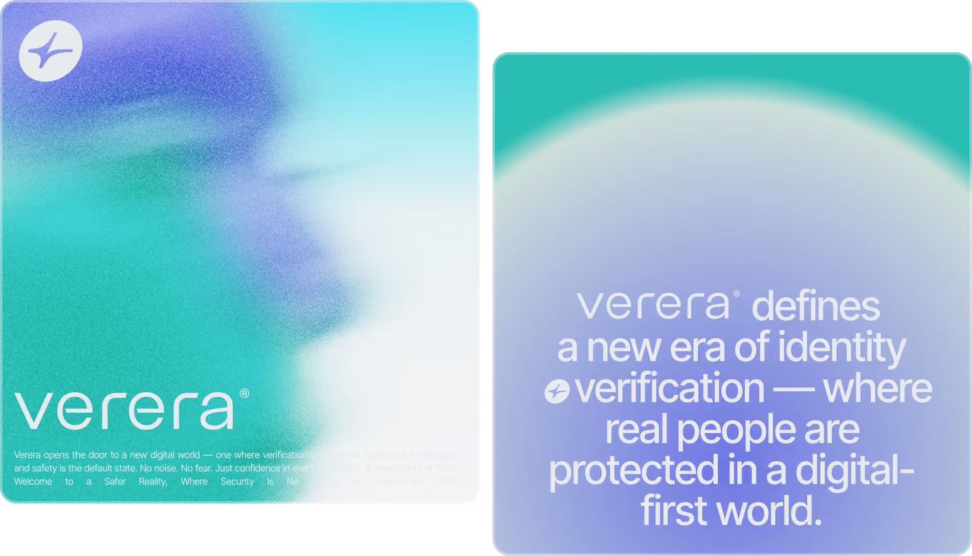
Verera was created as a rapid-launch branding project for the US market — a fast, focused response to the growing demand for understandable digital safety products in the age of fraud, AI manipulation, and deepfakes.
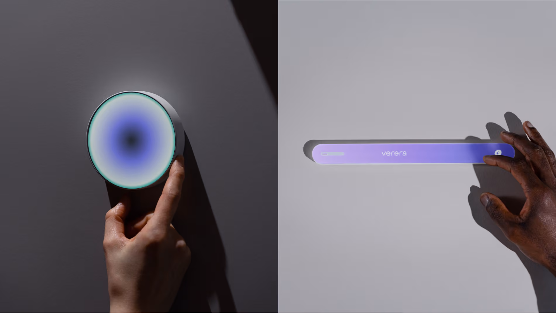
The scope included naming, logo design, visual identity, and a simplified marketing website designed to communicate trust instantly without relying on technical overload.
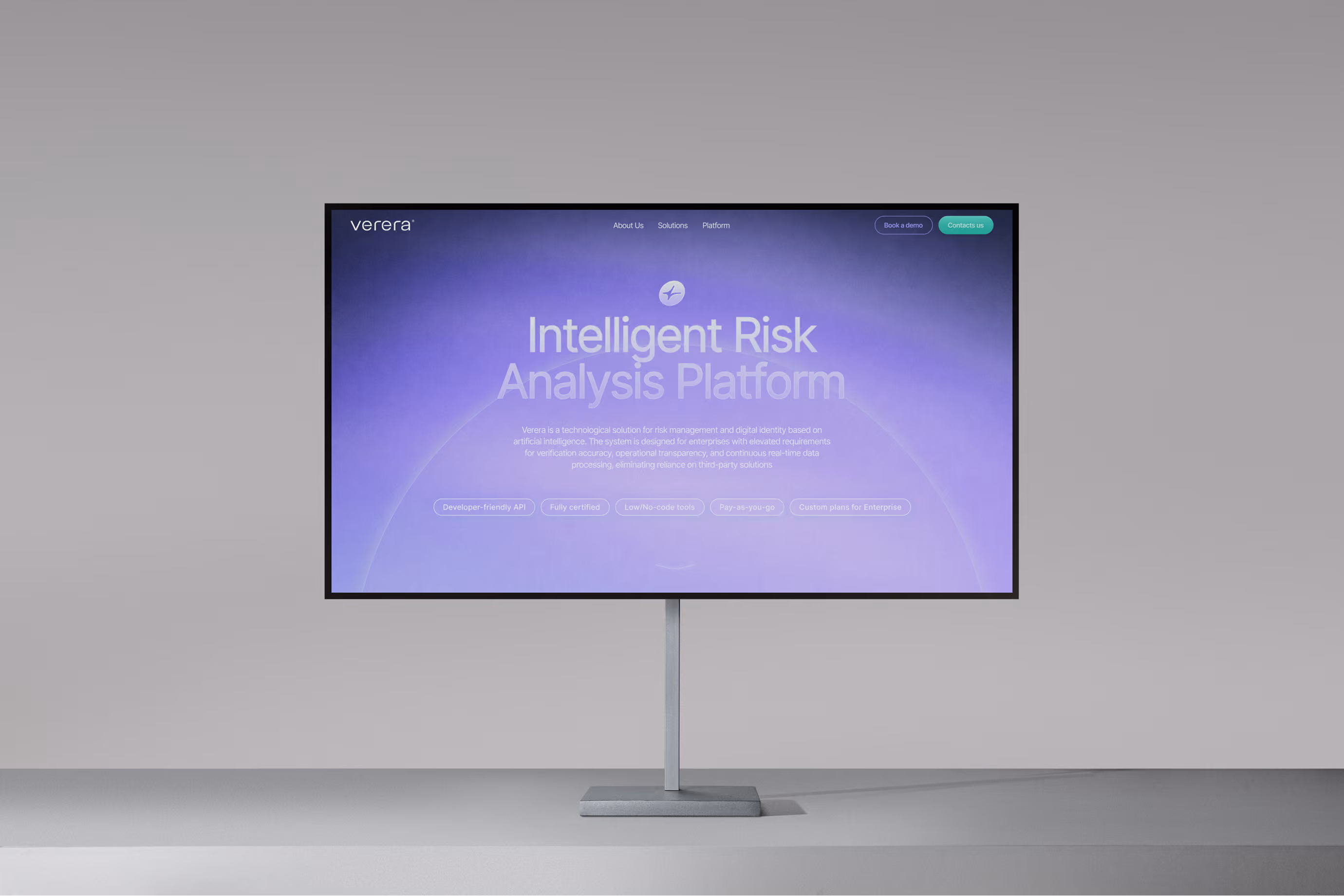
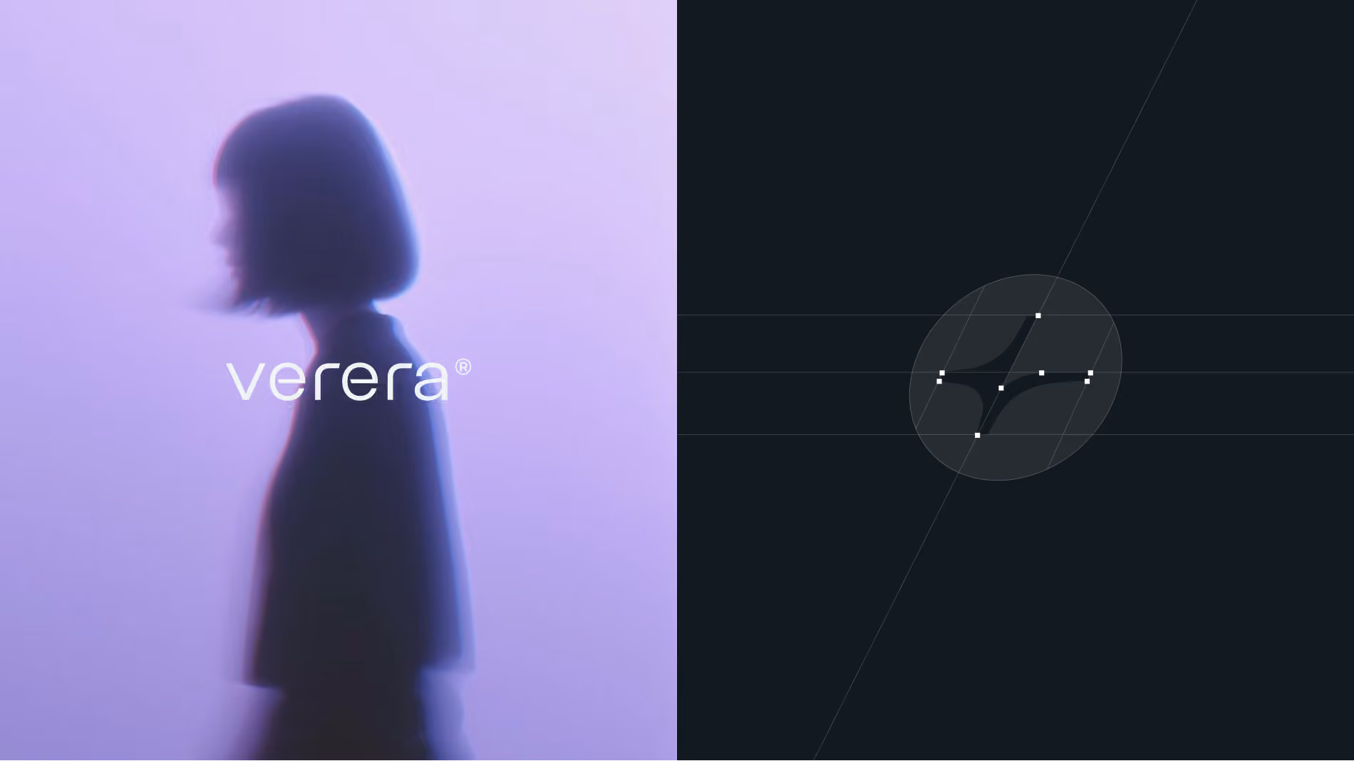
Unlike many cybersecurity startups that position themselves through fear, complexity, or aggressive “future-tech” aesthetics, Verera required the opposite emotional response. The product needed to feel calm, approachable, and optimistic. Safe not because it looks militarized — but because it feels stable, clear, and human.
This became the central strategic challenge.

Welcome To A Safer Internet

The core positioning behind Verera emerged from a simple observation:Most cybersecurity products already look dangerous before the user even opens them.
Dark interfaces, aggressive visuals, warning symbols, neon hacking aesthetics — the category is saturated with fear-based communication. But real trust is rarely built through anxiety.
Verera was designed to feel fundamentally different.
Instead of visualizing cyber threats themselves, the brand visualizes the emotional state people actually want to experience online: clarity, calmness, confidence, and control.

A Softer, Smarter Era of Protection Against
Digital Fraud and Deepfakes

This is where the metaphor of the sunrise became central to the project.
The visual language represents the beginning of a safer digital era — a transition away from confusion, manipulation, fraud, and invisible online threats toward transparency and protection. The rising digital sun inside the identity system became both a symbolic and emotional anchor for the brand.

More