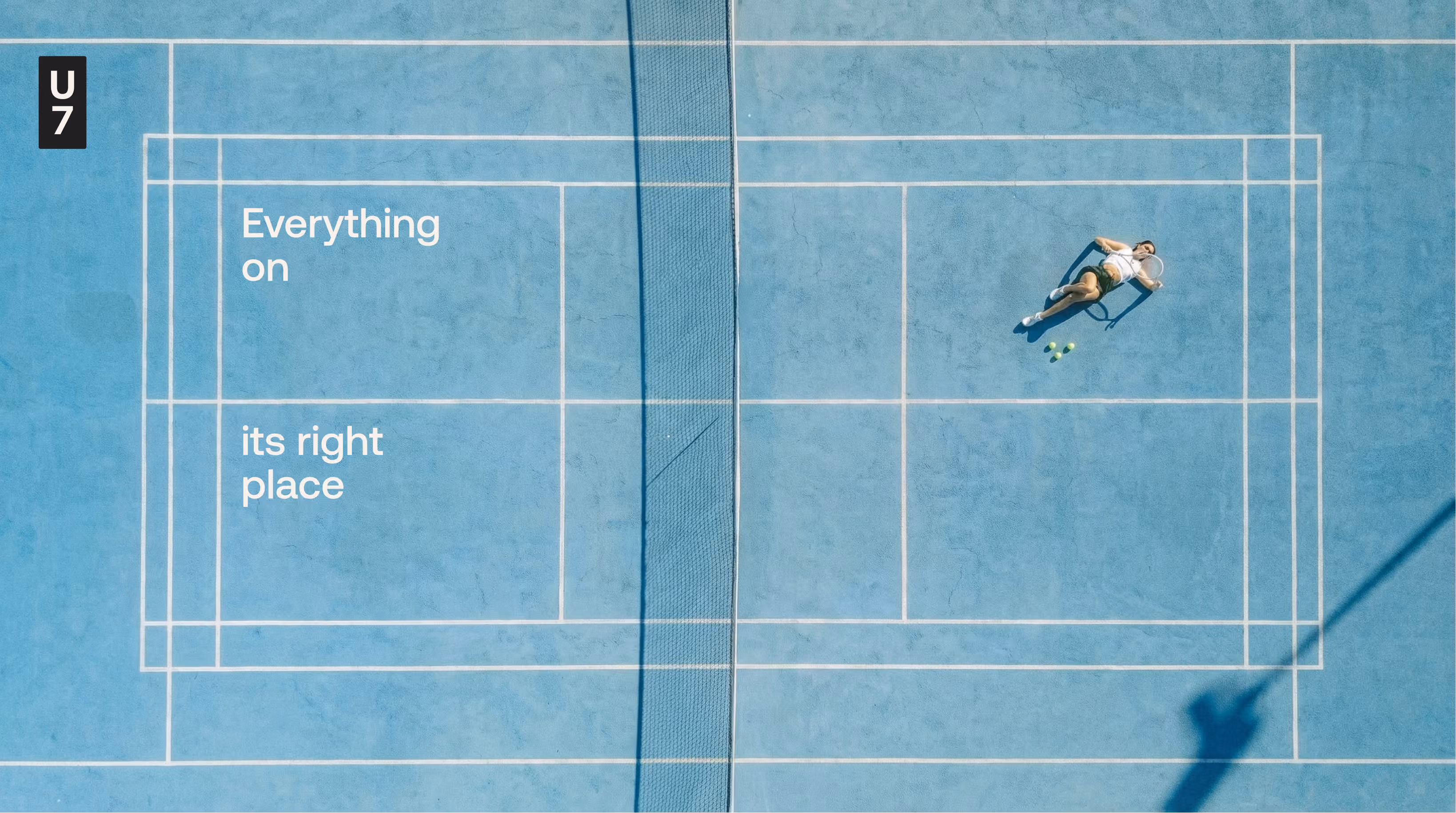
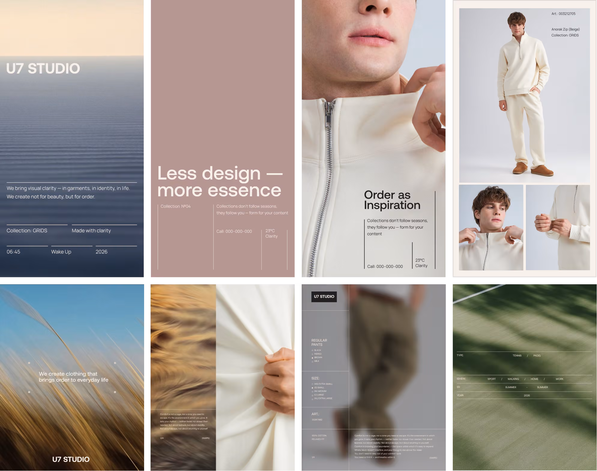
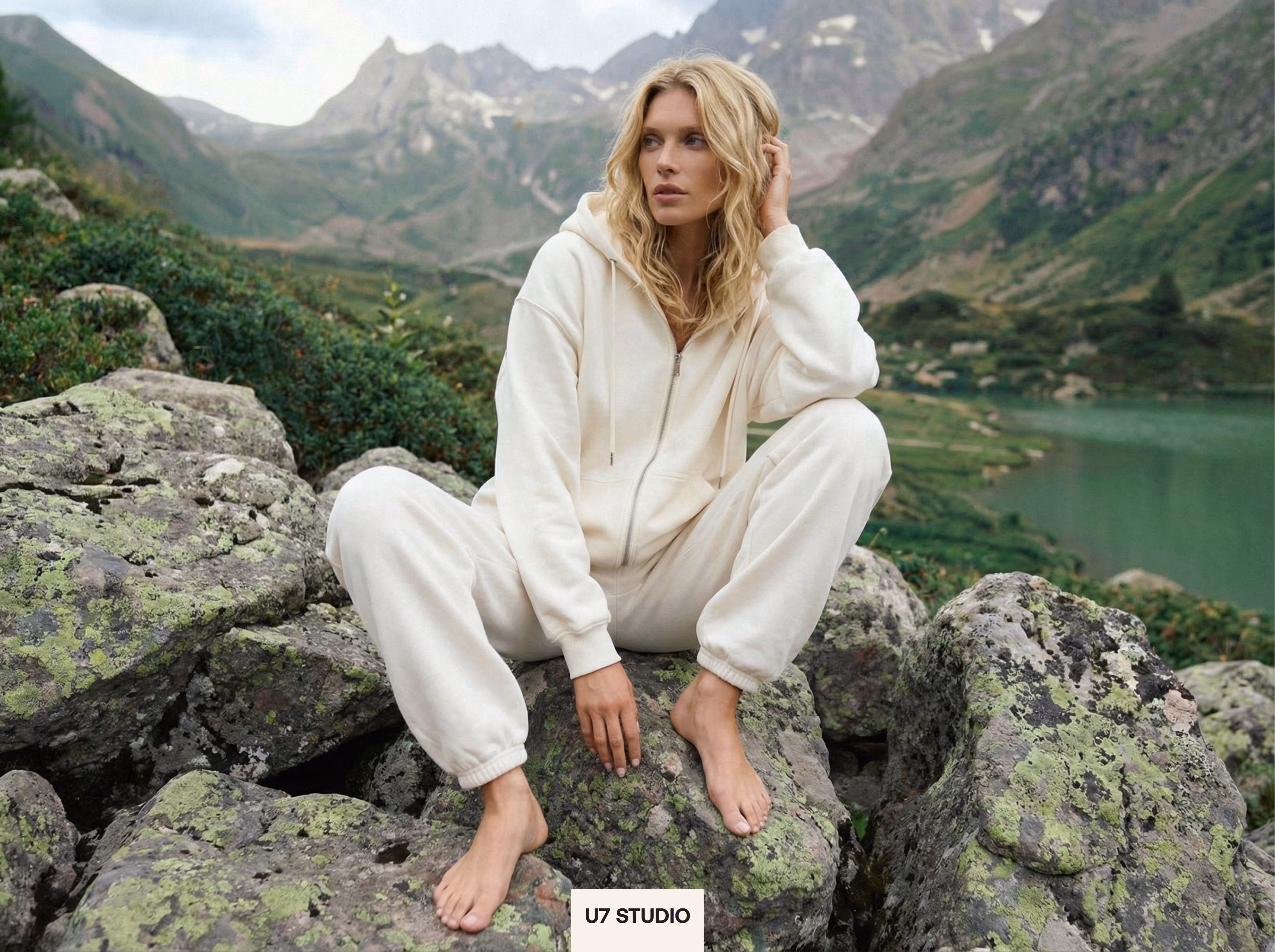
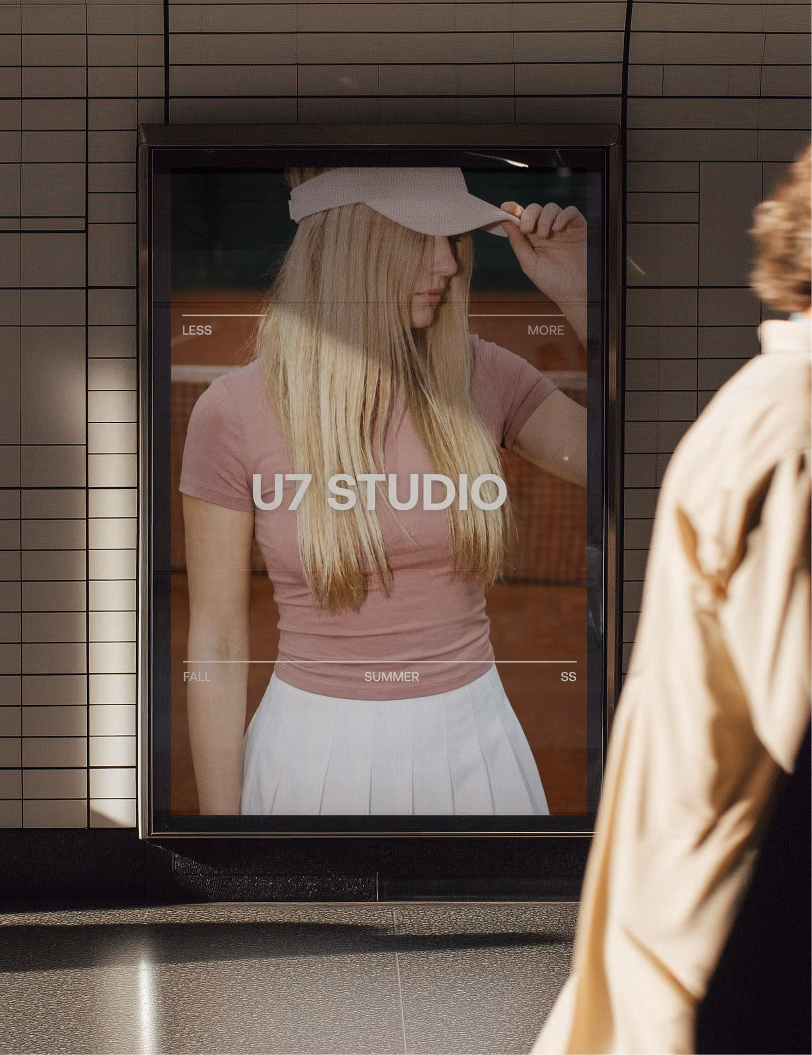
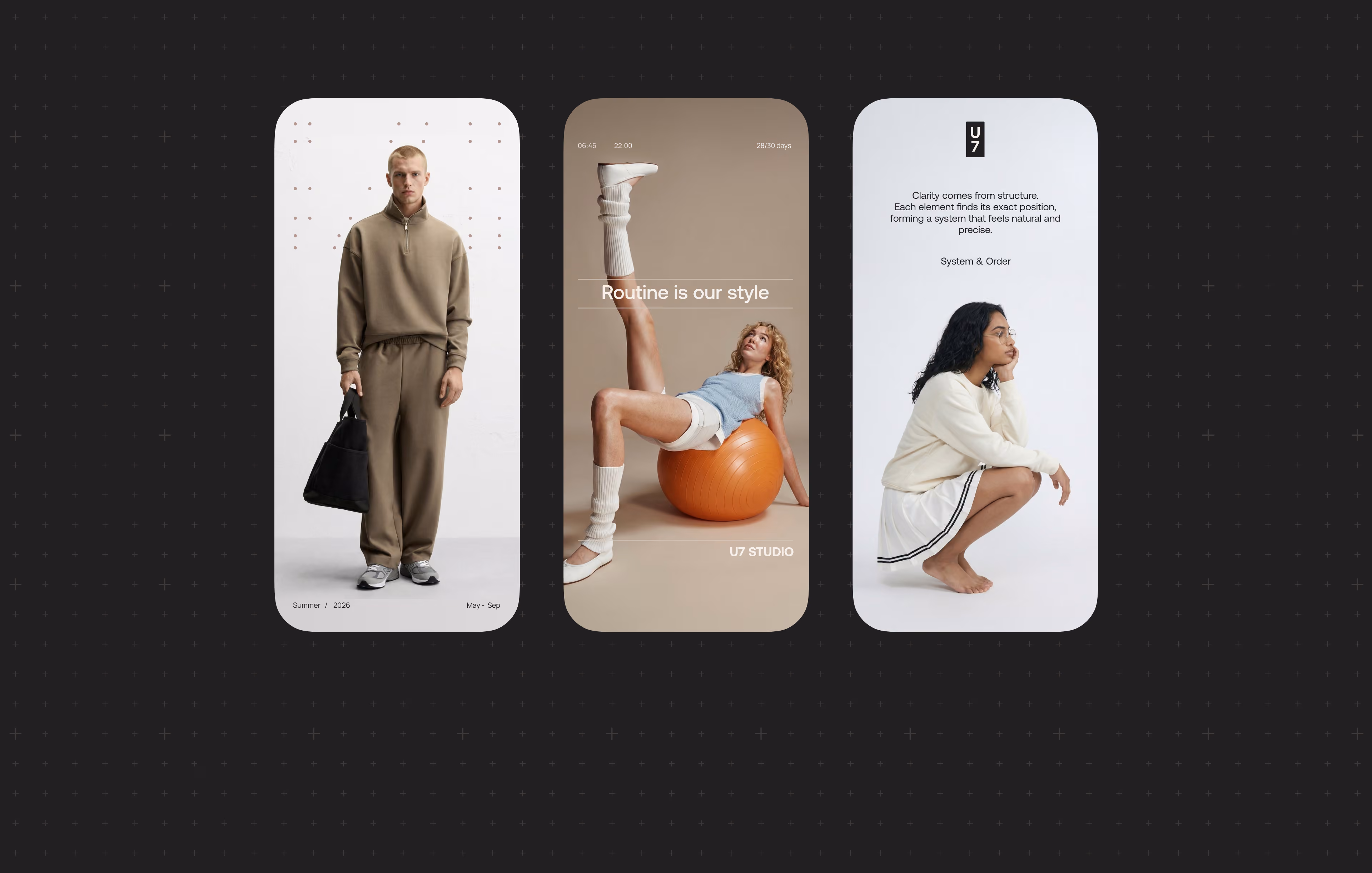
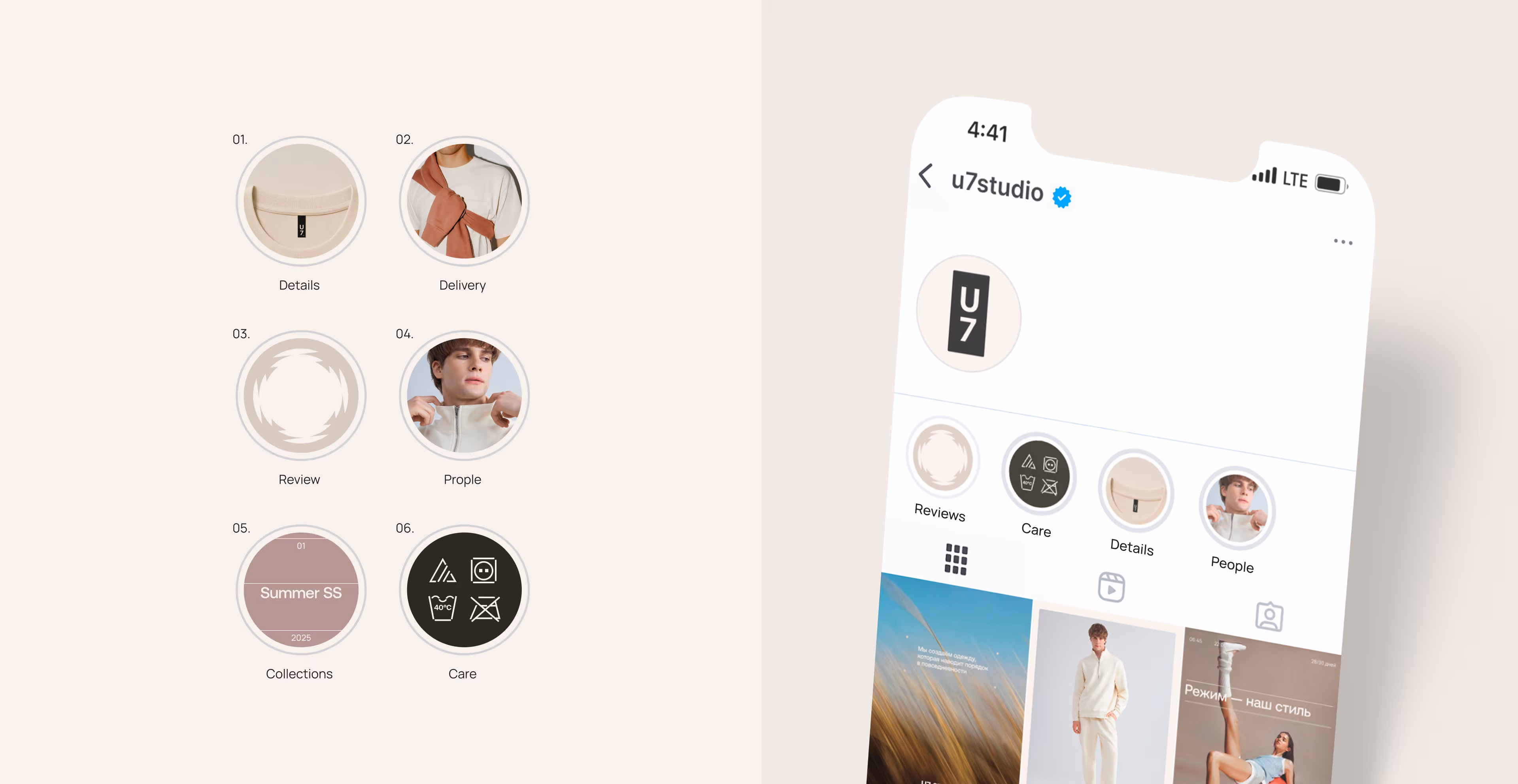
U7 Studio is a contemporary athleisure and everyday wear brand built around comfort, structure, and clarity. The project explores clothing as part of a daily system: something that helps organize movement, routine, wardrobe, and personal rhythm. The brand focuses on universal pieces for different everyday situations — from home and rest to movement, work, and active life.
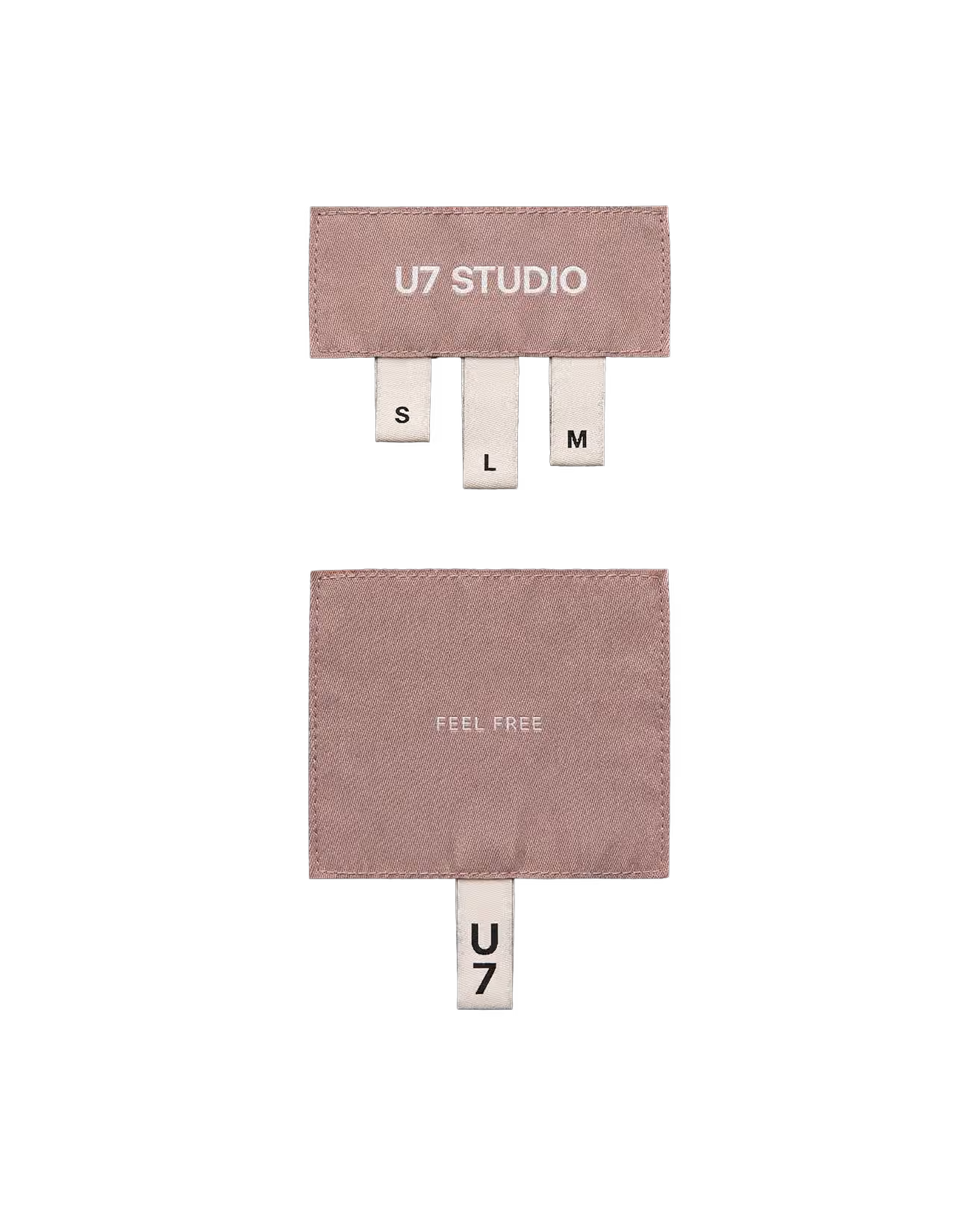
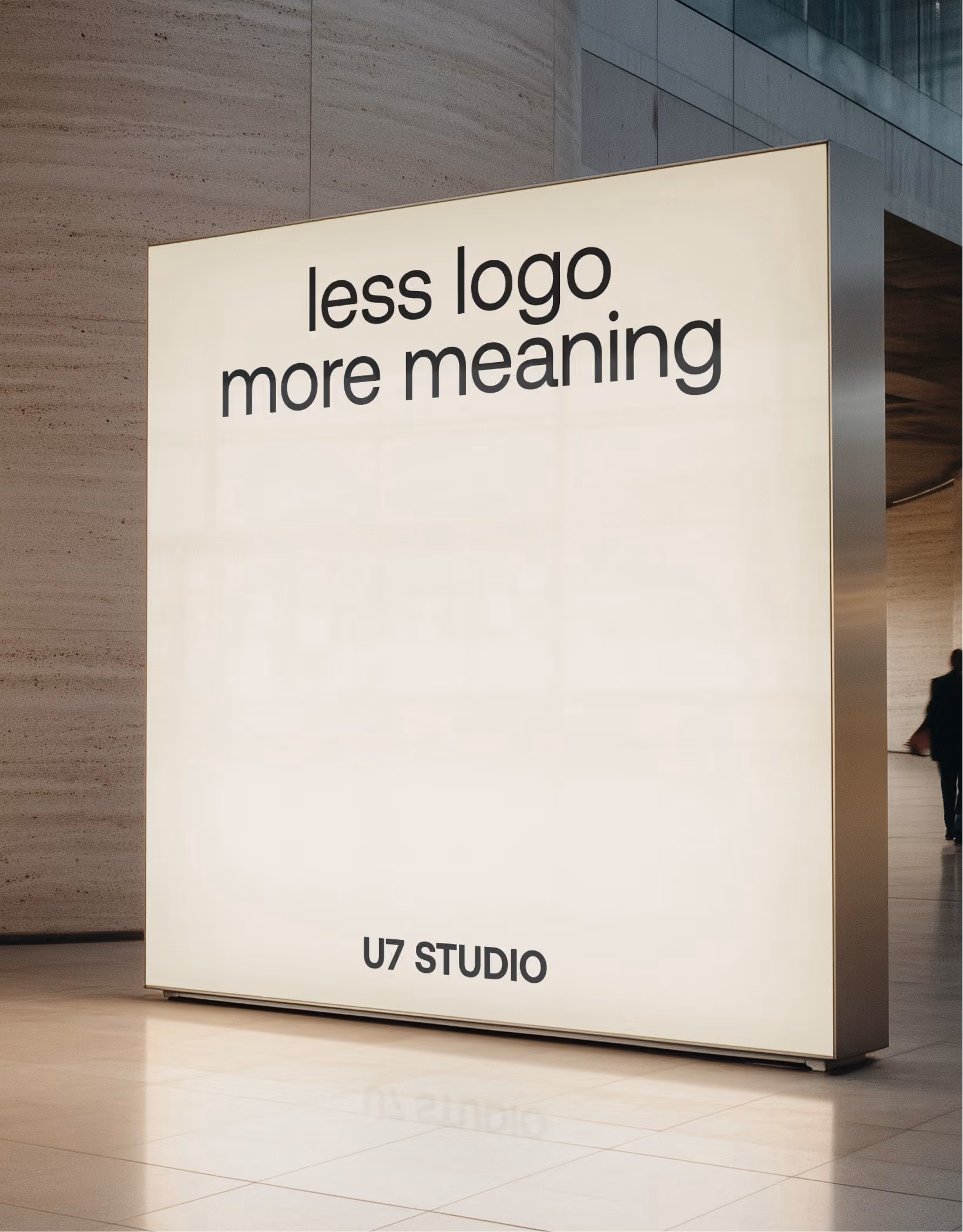
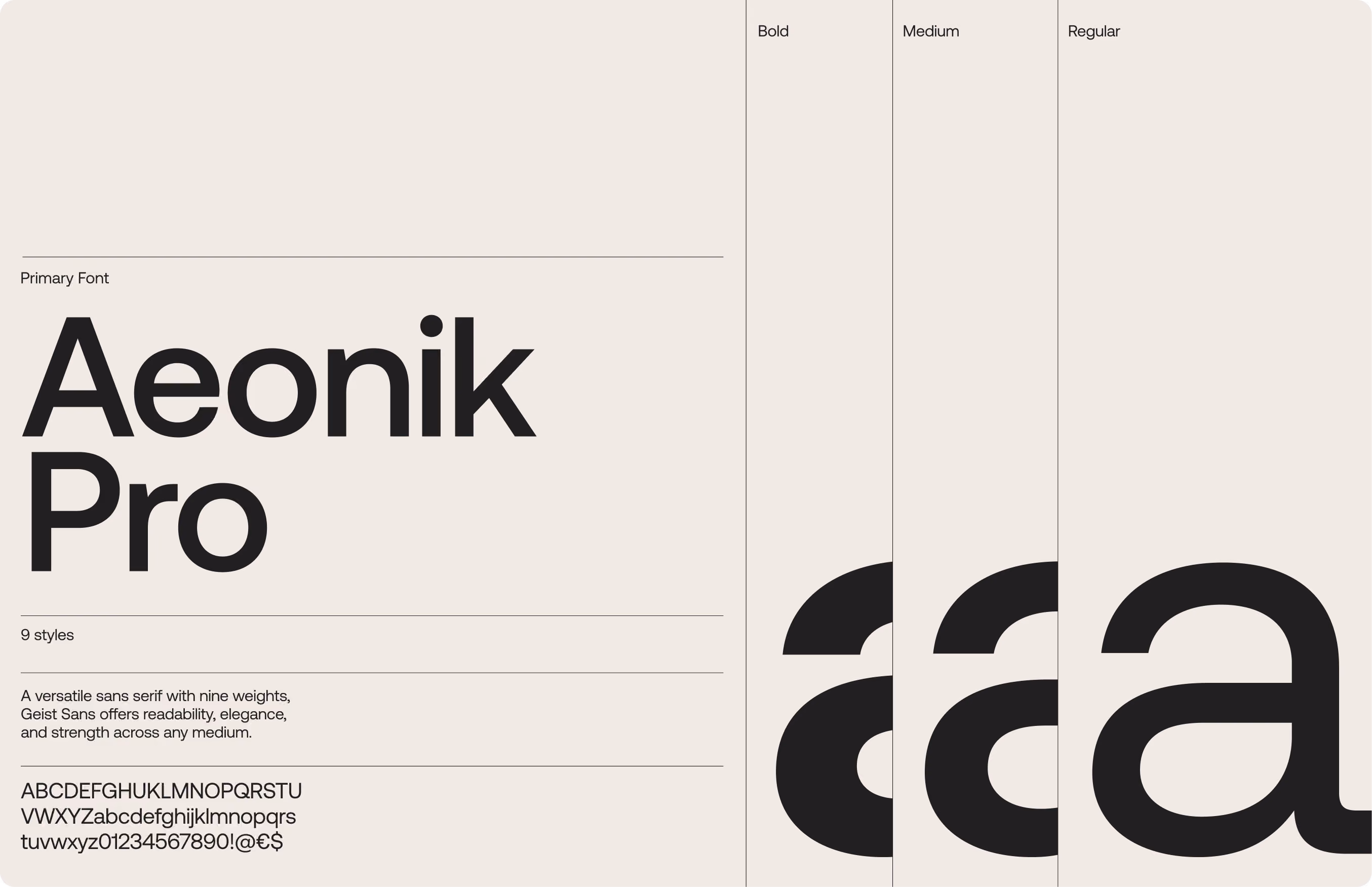
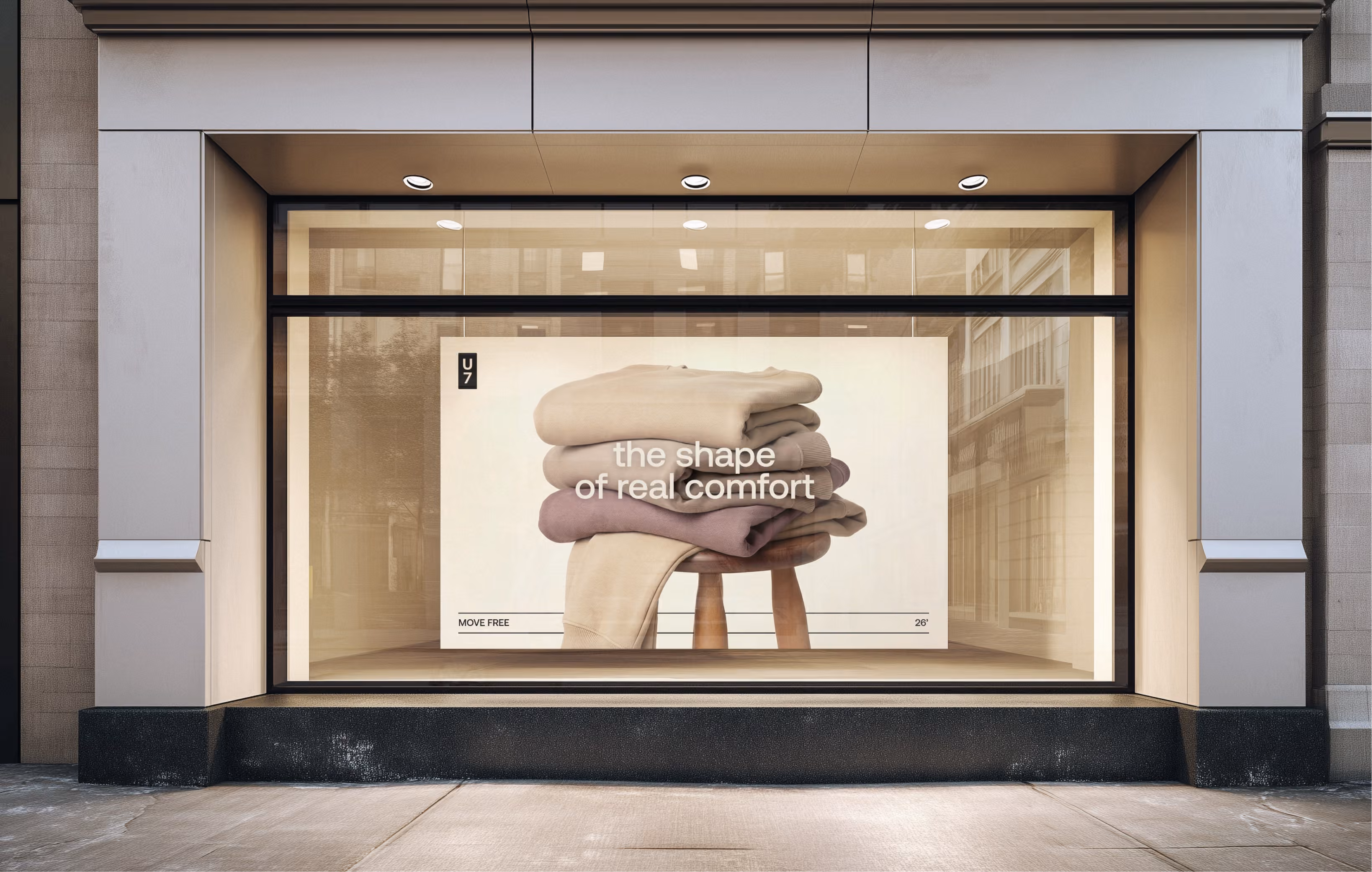
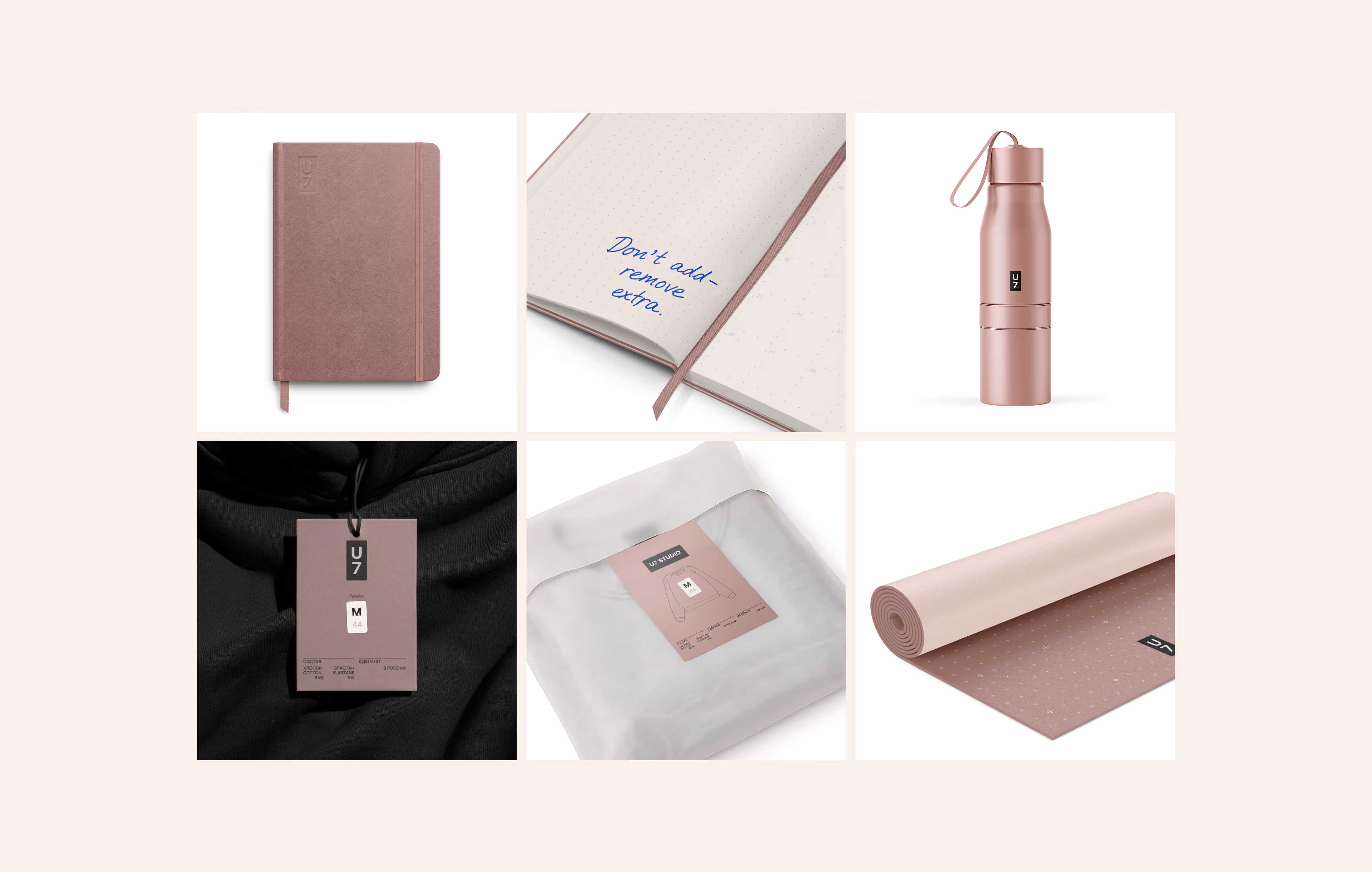
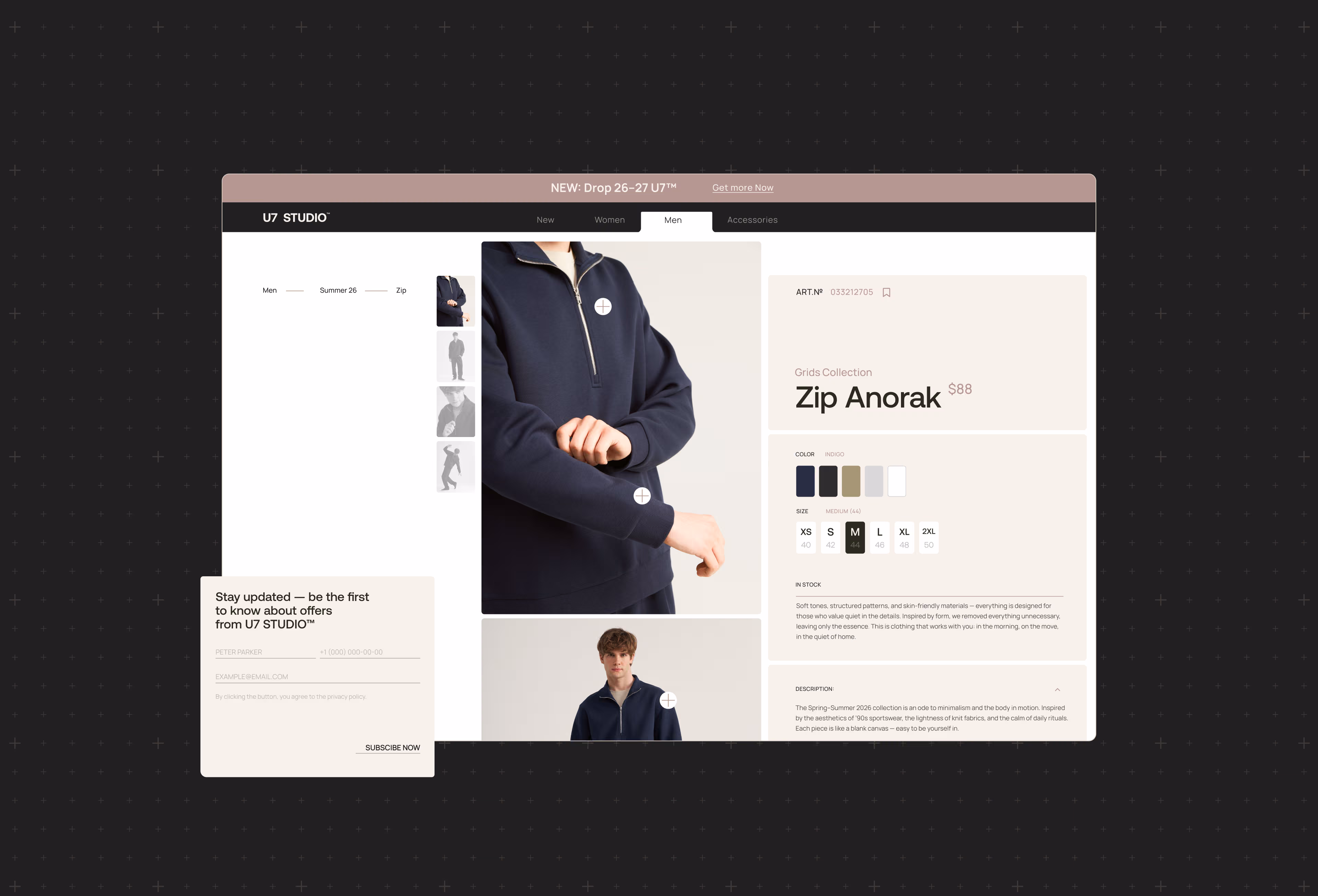
The visual identity is rooted in functional marking, technical labels, grids, calendars, planners, and systems that help bring order to information. U7 Studio works with apparel design, brand strategy, naming, visual identity, packaging, label design, rich content for marketplaces, website design, social media design, and brand book development. The core idea is simple: less noise, more clarity. Clothing, typography, labels, packaging, and digital layouts all become parts of one system — calm, structured, practical, and made for inner comfort.