Close It

Let’s break down your idea and turn it into a clear brand that actually works

We begin with a call to identify the real problem and shape the right direction before anything is designed.
Your Name
Contact Number
By clicking the button, you agree to our privacy policy 
and the processing of your personal data.
Contact Us

Success (´・ᴗ・ ` )
Request received

We’ll review your input and get back to you to align on the next step.
Back to Site
Error. Couldn’t send.
Please check and try again. ~(>_<~)
Submit Request

Let'sim

Client
Mobinex
Services
  • Research
  • Branding
Country
London
Year
2025
Let’SIM started as a fast-track branding project for an international eSIM service, but quickly evolved into a much larger product launch system that included brand strategy, naming, visual identity, website presentation, communication structure, and sales positioning.
The main challenge was unusually delicate: the brand had to enter the CIS and post-Soviet travel market from a London-based foundation without feeling foreign, overly corporate, or technologically cold. Most telecom and eSIM brands in the category rely on either sterile tech aesthetics or aggressive “cheap roaming” messaging. Both approaches destroy emotional trust. Especially in travel.

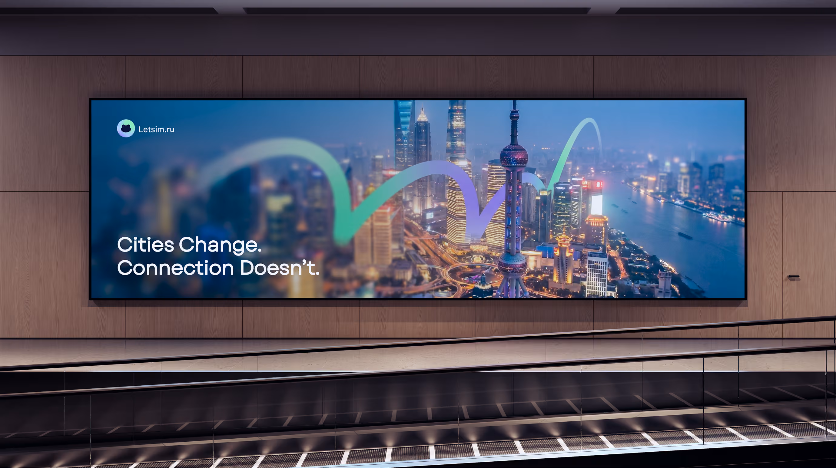
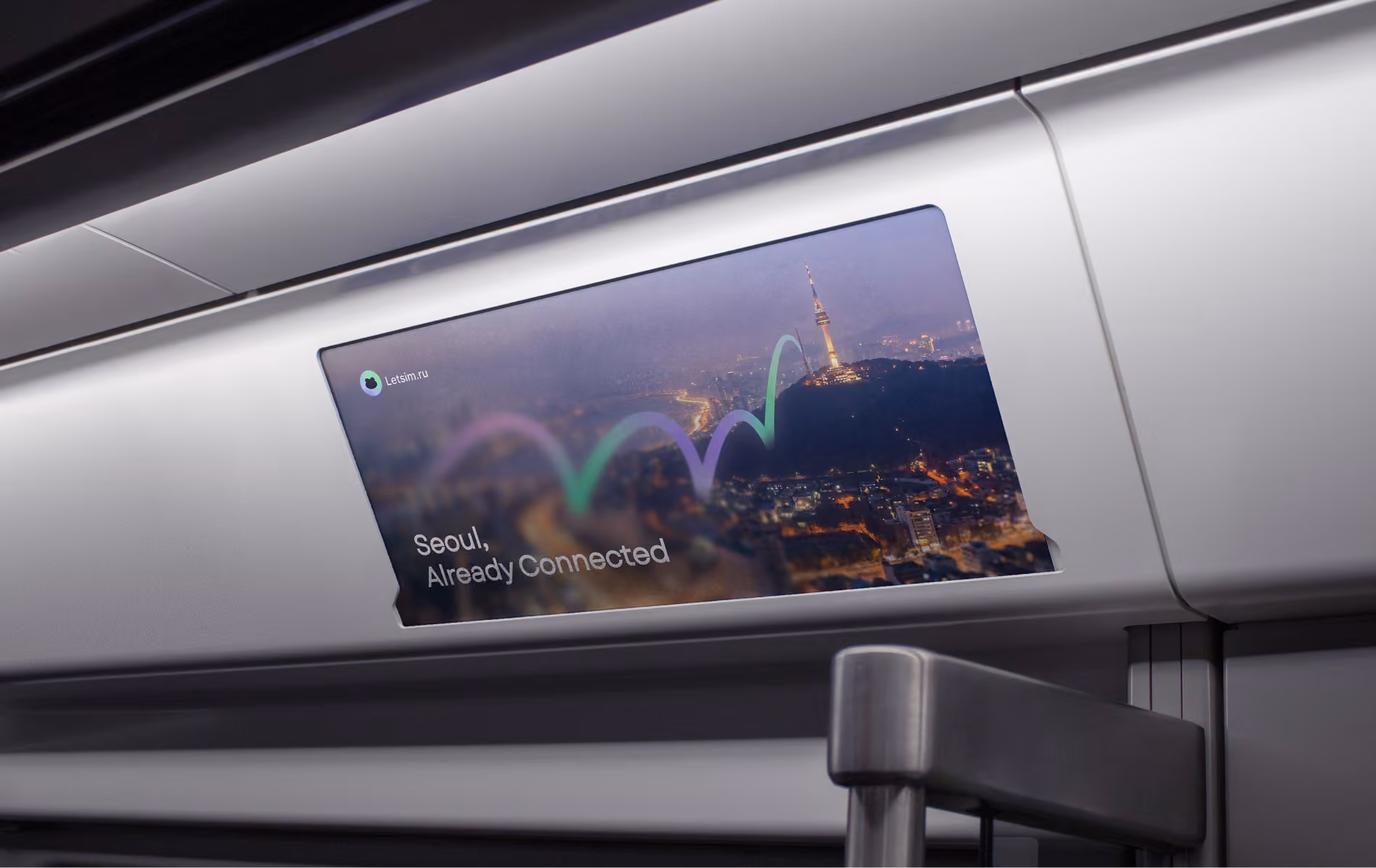
Let’SIM Turns Mobile Connection Into Something Invisible, Instant, and Effortlessly

Through research and positioning analysis, we identified that mobile connection during travel is perceived less like a telecom product and more like a survival tool — something closer to a first-aid kit, navigation system, or passport. People rarely think about internet connection until the exact moment they desperately need it.
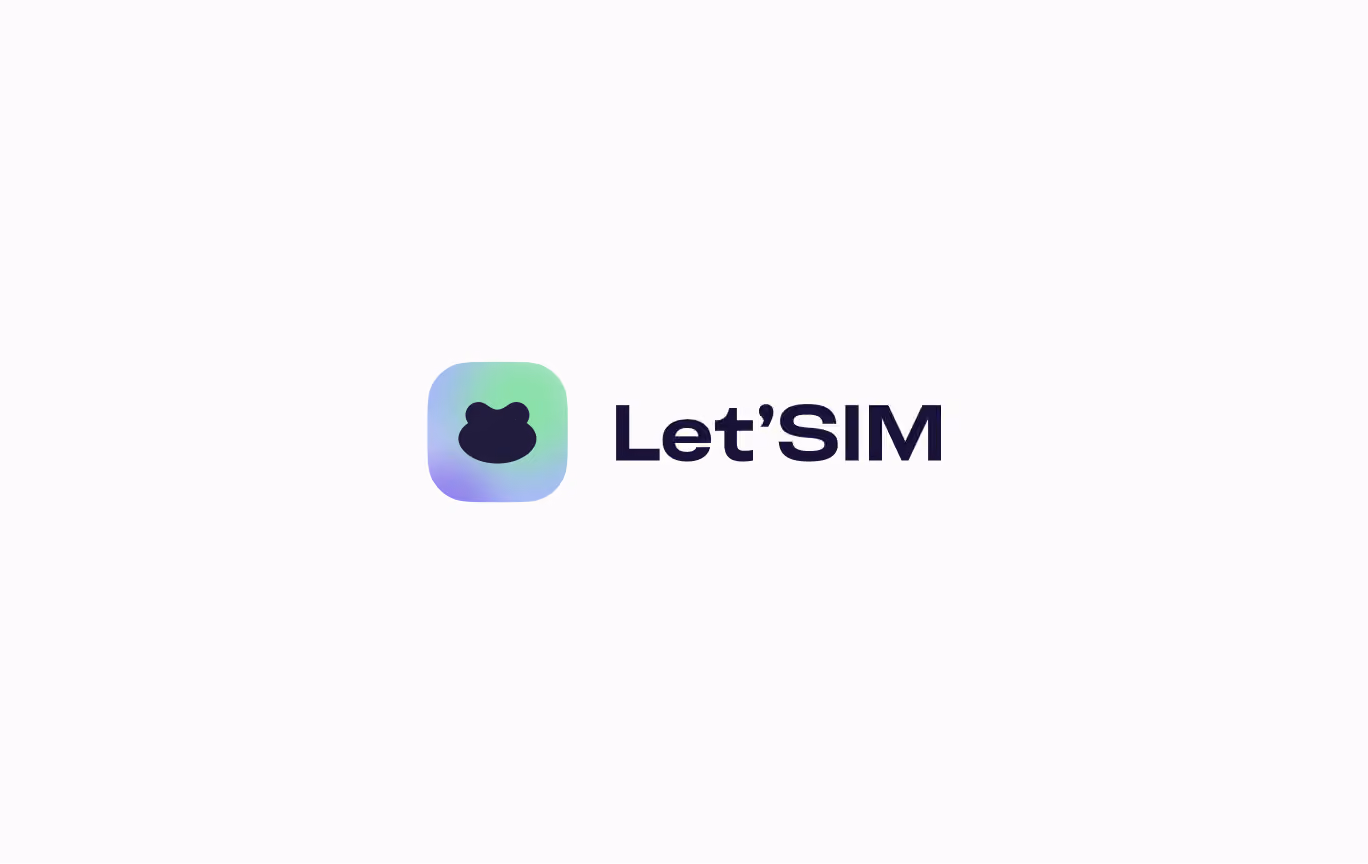
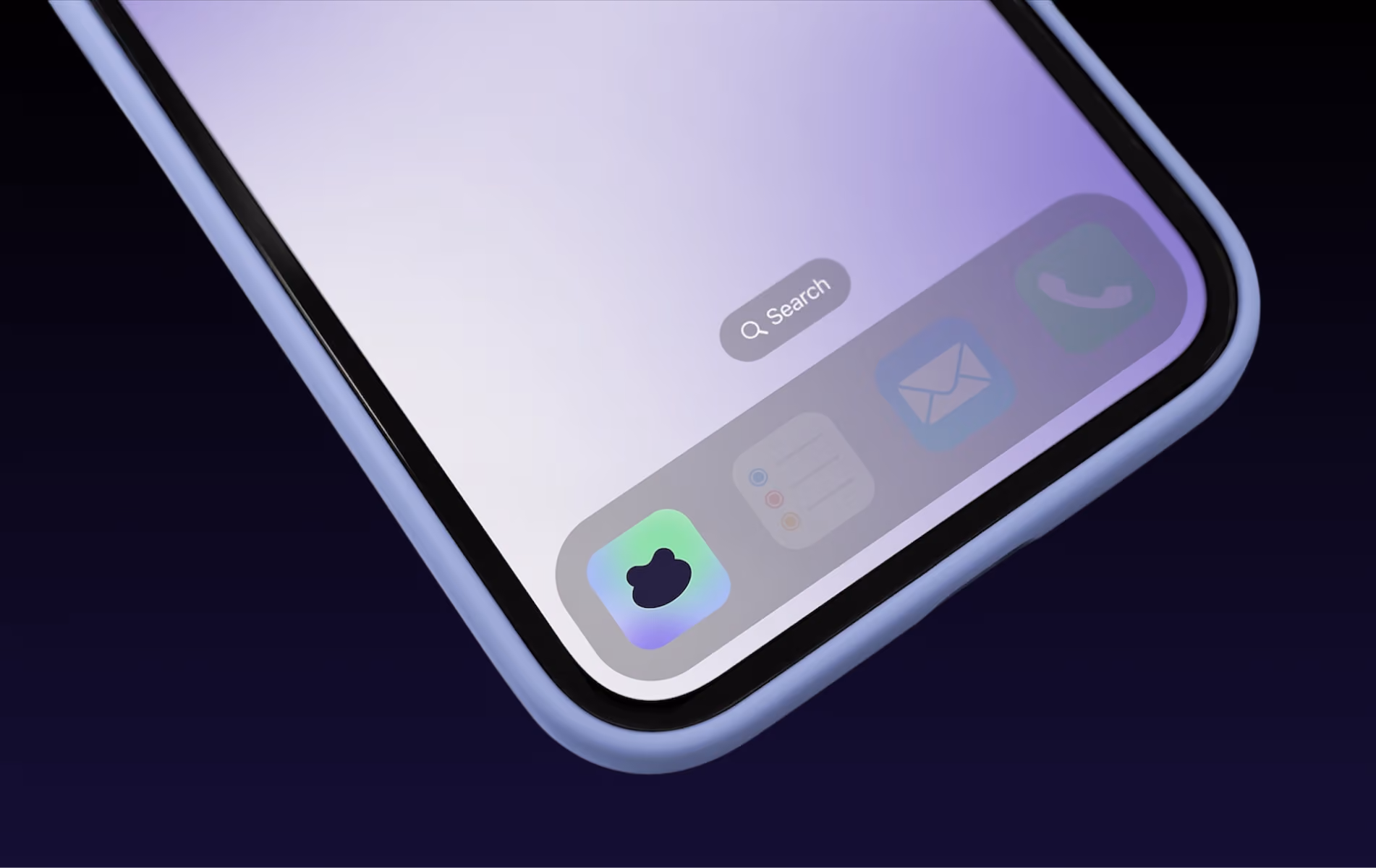
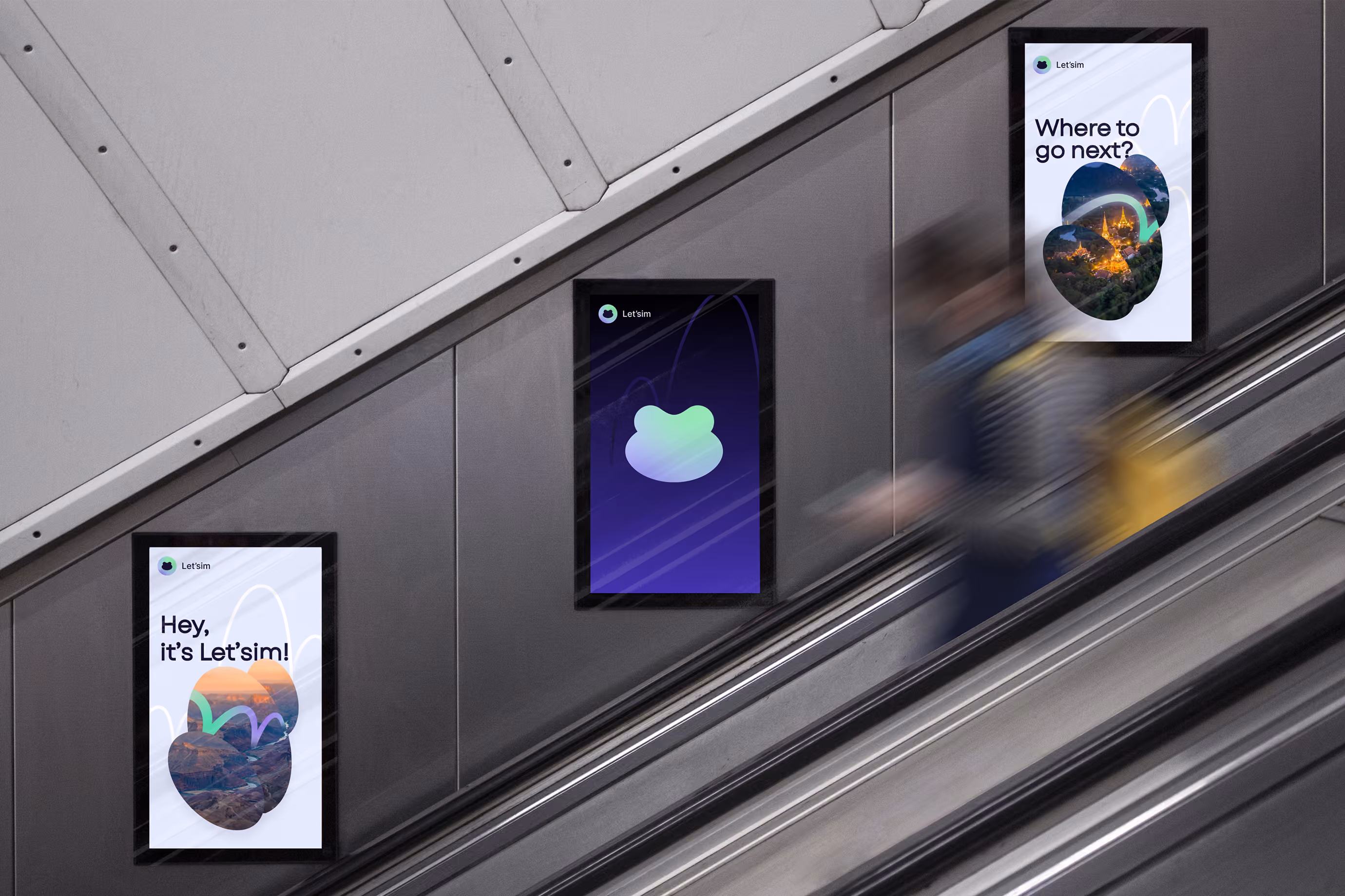
This insight completely shifted the direction of the branding.Instead of building another “digital telecom startup,” we created a lightweight travel companion built around one instantly recognizable metaphor: the traveling frog. A creature constantly jumping between places, borders, climates, and destinations with ease and instinctive freedom.
The entire identity system was intentionally simplified to preserve this feeling. The brand needed to feel immediate, effortless, and understandable within seconds — exactly like the product itself. Not over-designed. Not overloaded with storytelling. Just clear, memorable, emotionally alive branding for a global travel eSIM platform.
Core Brand Identity Code: Shapes & Colors

One Jump Away From Anywhere

The frog symbol became the emotional anchor of the project because of its unusual balance between friendliness and functionality. It feels recognizable without needing explanation. This dramatically increased memorability across app interfaces, onboarding screens, digital ads, and social media communication.
Jumping arcs inside the graphics imitate routes, transitions, flights, and invisible network switching between countries. Gradients were used not as decorative effects, but as a metaphor for seamless transition between locations, operators, and states of travel. Every element inside the branding system reinforces mobility, accessibility, and ease of navigation.

The Internet
That Travels With You

The strongest insight discovered was that people do not want to “manage telecom services” while traveling. They want movement without interruption.
That became the core of the entire brand system.
The frog metaphor was not created artificially for marketing purposes — it emerged naturally from the behavior of the product itself. Jumping between countries, switching networks instantly, adapting without friction, moving lightly through unfamiliar environments. The symbolism worked because the product already behaved this way.
This became the foundation of the visual identity, naming system, motion language, and communication tone.
The naming process explored dozens of directions, including more abstract and premium-sounding options. But ultimately, Let’SIM solved the hardest problem better than any alternative: immediate recognition. The name works almost like a call to action while simultaneously embedding the product category directly into the brand itself. Even at the scale of a tiny mobile app icon, the service remains instantly identifiable.

Mobile App Button

More