Close It

Let’s break down your idea and turn it into a clear brand that actually works

We begin with a call to identify the real problem and shape the right direction before anything is designed.
Your Name
Contact Number
By clicking the button, you agree to our privacy policy 
and the processing of your personal data.
Contact Us

Success (´・ᴗ・ ` )
Request received

We’ll review your input and get back to you to align on the next step.
Back to Site
Error. Couldn’t send.
Please check and try again. ~(>_<~)
Contact Us

Dataspike

Client
Dataspike
Services
  • Branding
  • Motion
  • UI/UX Design
Country
Cyprus
Year
2026
DATASPIKE is a cybersecurity company focused on KYC, AML, and data analysis systems related to fraud detection and user protection. The project was created for the Danish company’s expansion into the U.S. market.
Our work included: research and analytics, logo, branding, visual identity system, website, umbrella brand structure, and product architecture.
One of the key challenges was to create a visual language that felt modern without relying on typical AI aesthetics. Most cybersecurity brands use similar visual codes: abstract neural graphics, neon gradients, and futuristic interfaces. Over time, this approach started to feel generic and quickly became visually outdated.
For DATASPIKE, it was important to build a more timeless system — one connected not to technological trends, but to the feeling of control, reliability, and precision.

Analog Reliability in Digital Security — a visual vocabulary of precision, trust, clarity, and human control

The visual language was built around the idea of a digital system inspired by analog devices. We referenced the aesthetics of physical interfaces — buttons, switches, control panels, and measuring instruments — to reinforce the feeling of control over data and reliability of processes.

This led to a visual system where the digital environment feels almost physical. The approach also aligned with a broader shift in interface design: from flat UI toward more tactile and dimensional systems. The typographic system is built around Helvetica. The choice was connected not only to its modernist heritage, but also to its perception within American visual culture — precise, neutral, and universal.

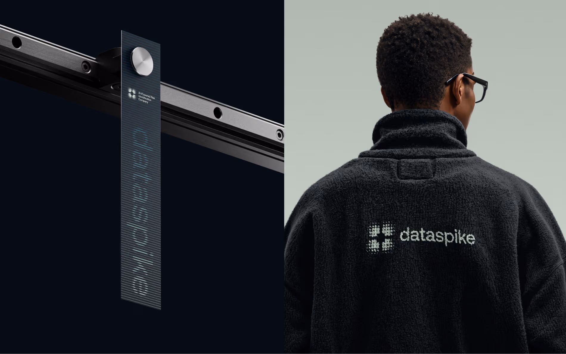
The logo remains direct and functional, without competing with the surrounding system. Its structure also subtly references a targeting scope — a metaphor for detecting threats within large volumes of data.

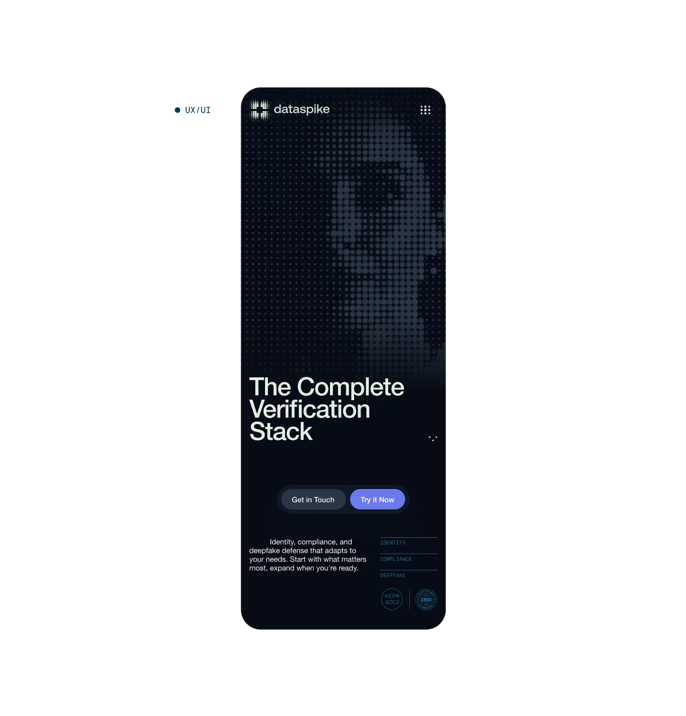
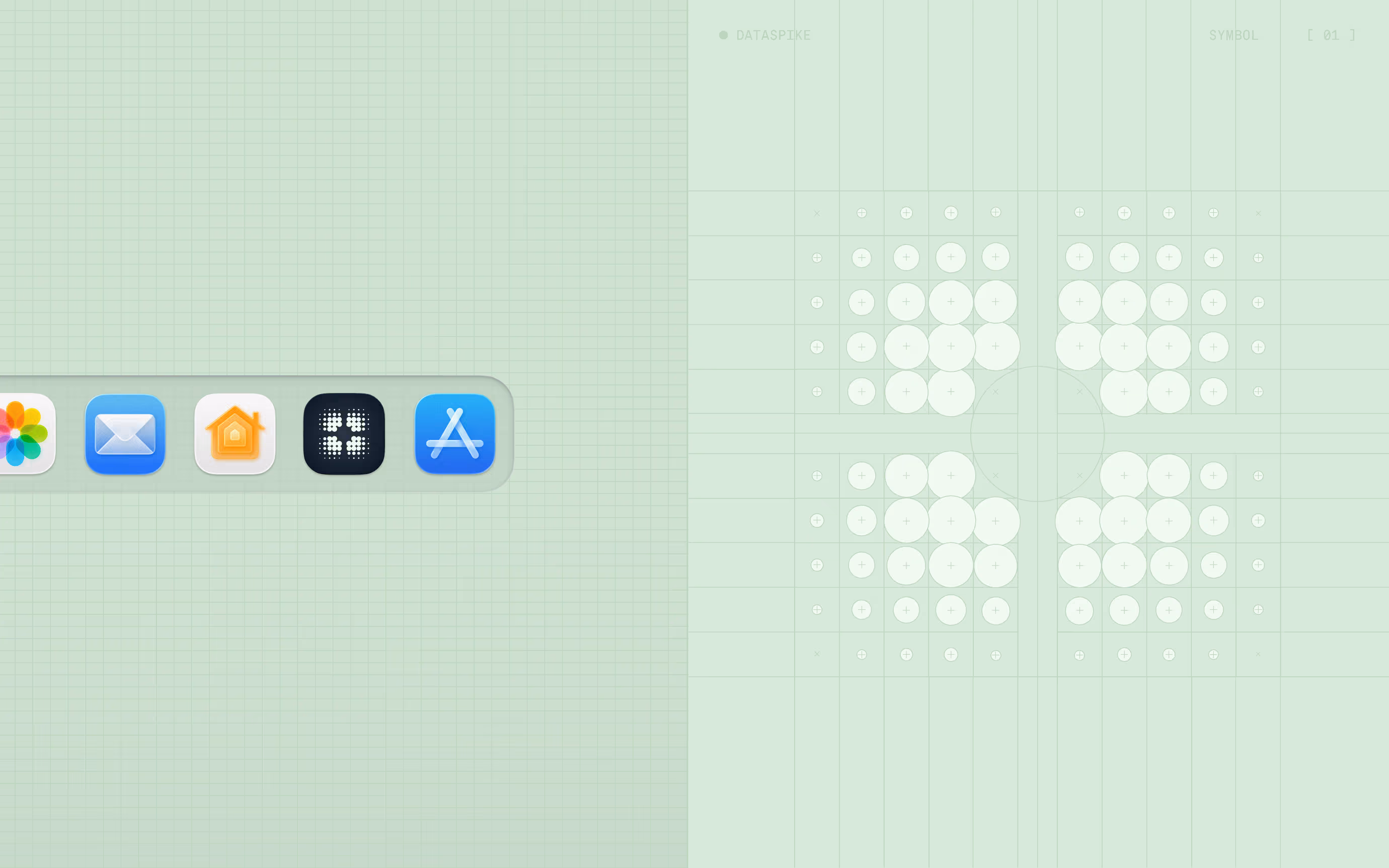
Data itself became the foundation of the visual language. The identity combines physical interface elements with data structures. Lines, charts, dots, analytical schemes, and signal forms are used as visual metaphors for the information flows DATASPIKE works with. Within the system, these data structures gradually form human silhouettes — reflecting the company’s core principle: identifying real people within massive volumes of data and separating fraudulent behavior from legitimate activity.

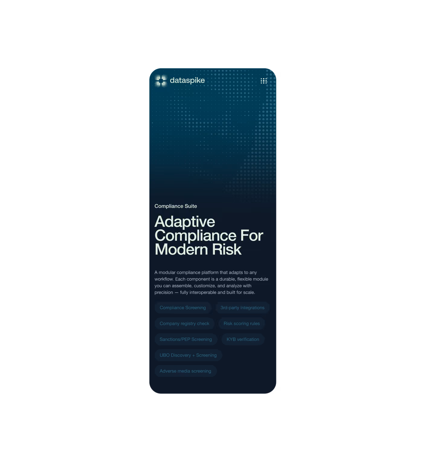
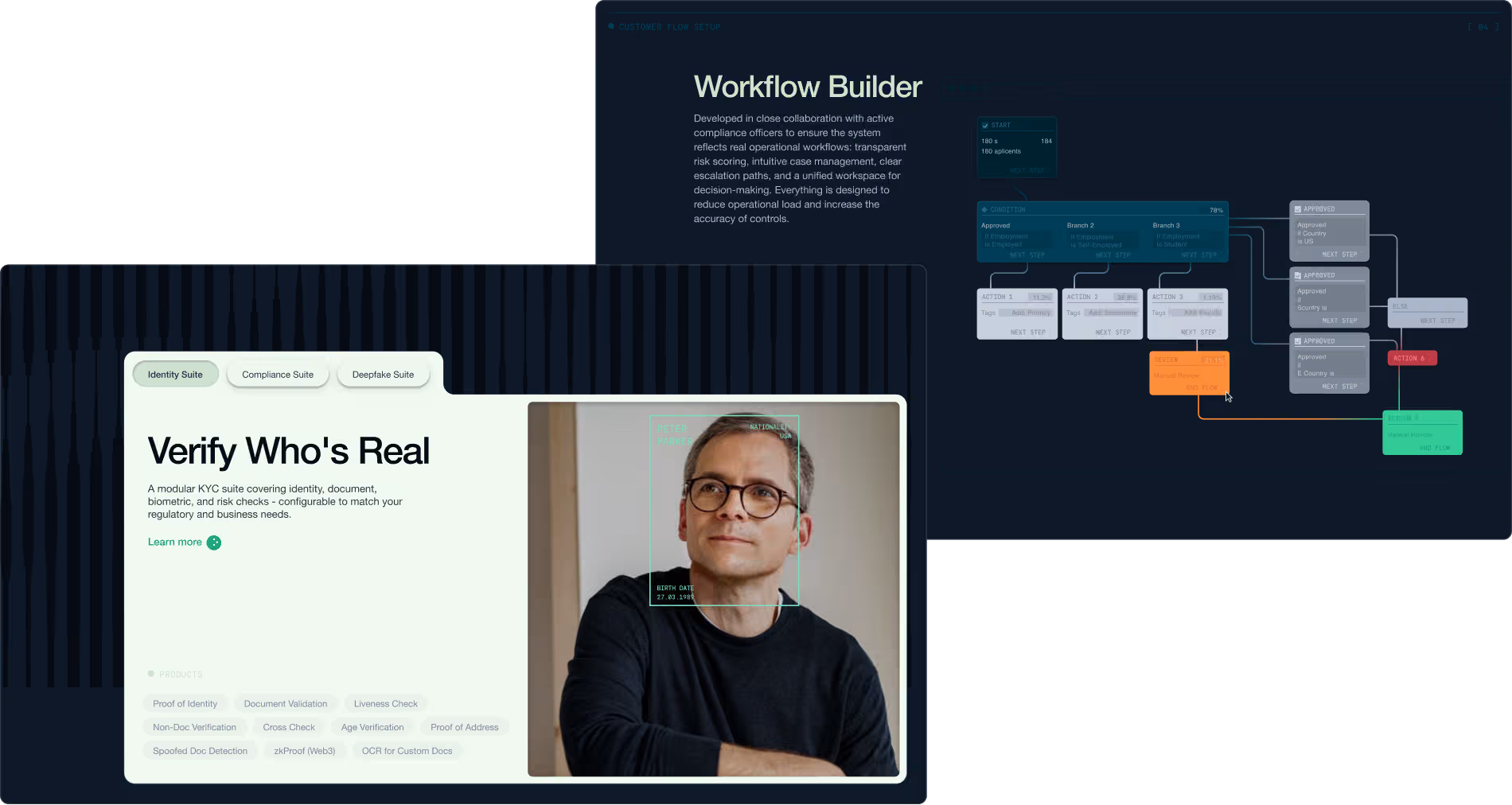
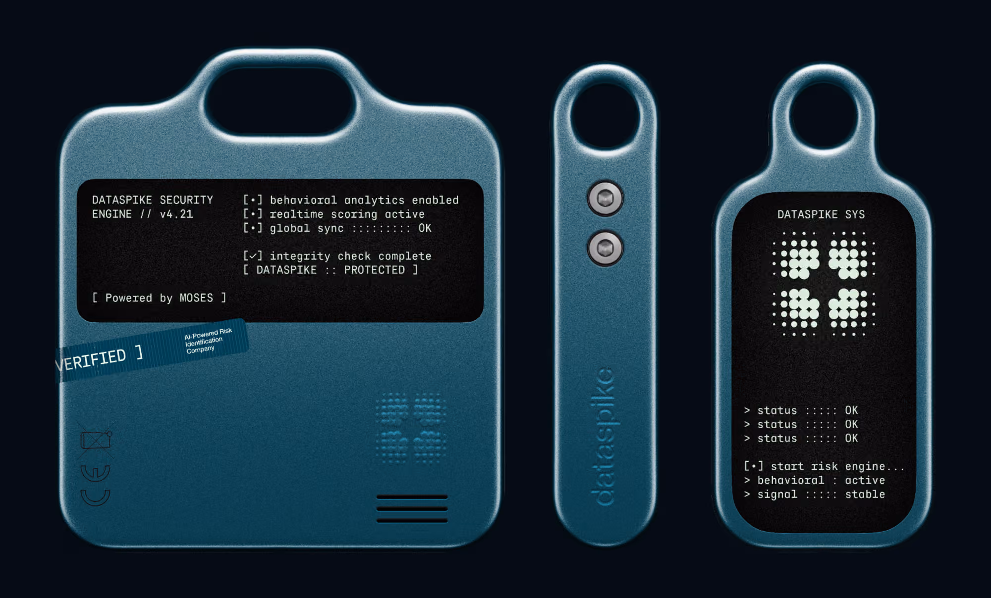
The website continues the same identity logic. The interface was designed to feel like an instrumental environment: controlled, precise, and physically tangible. Depth, lighting, interface states, and signal systems are used not as stylistic decoration, but as tools to reinforce the platform’s reliability.

More