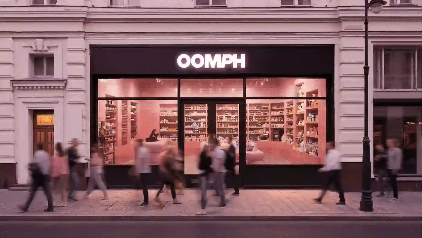
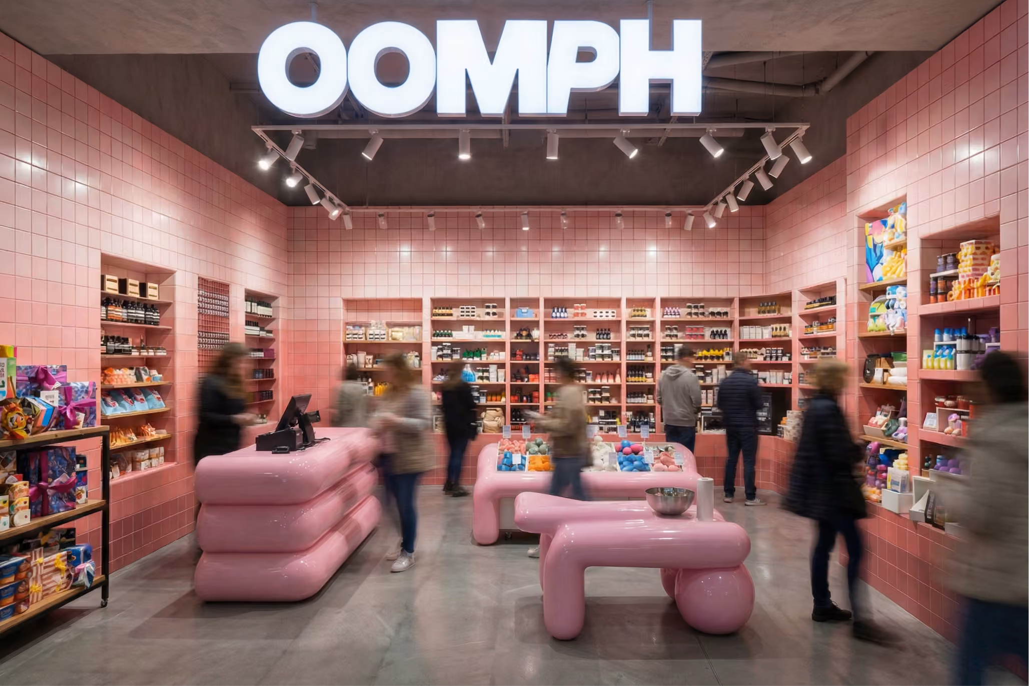
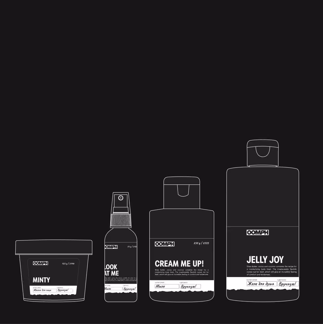
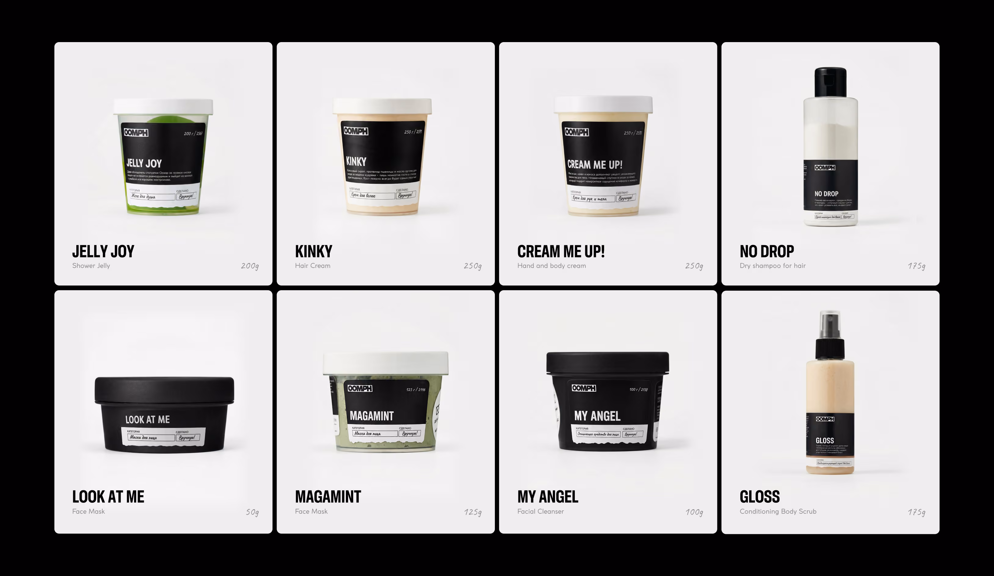
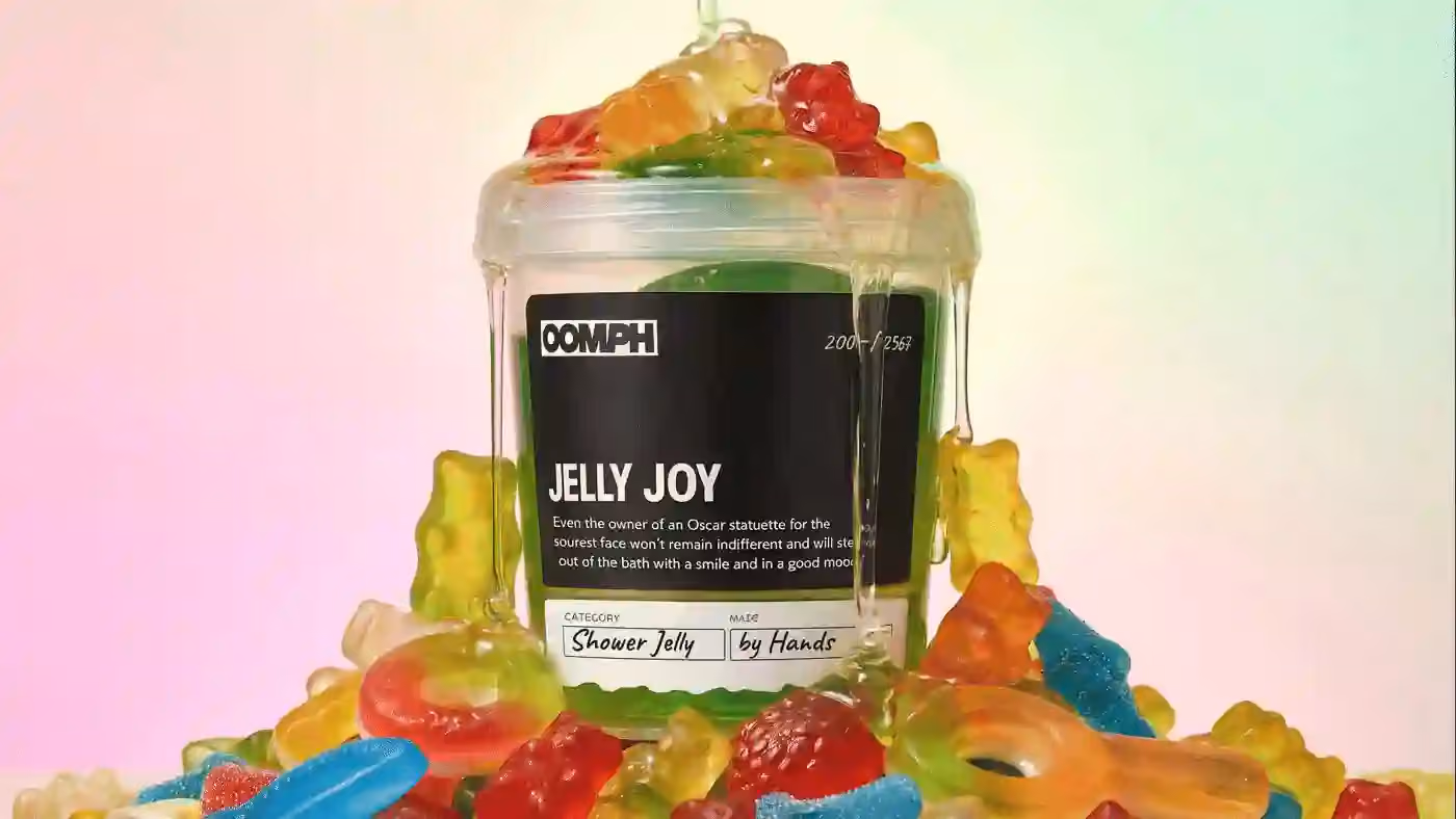
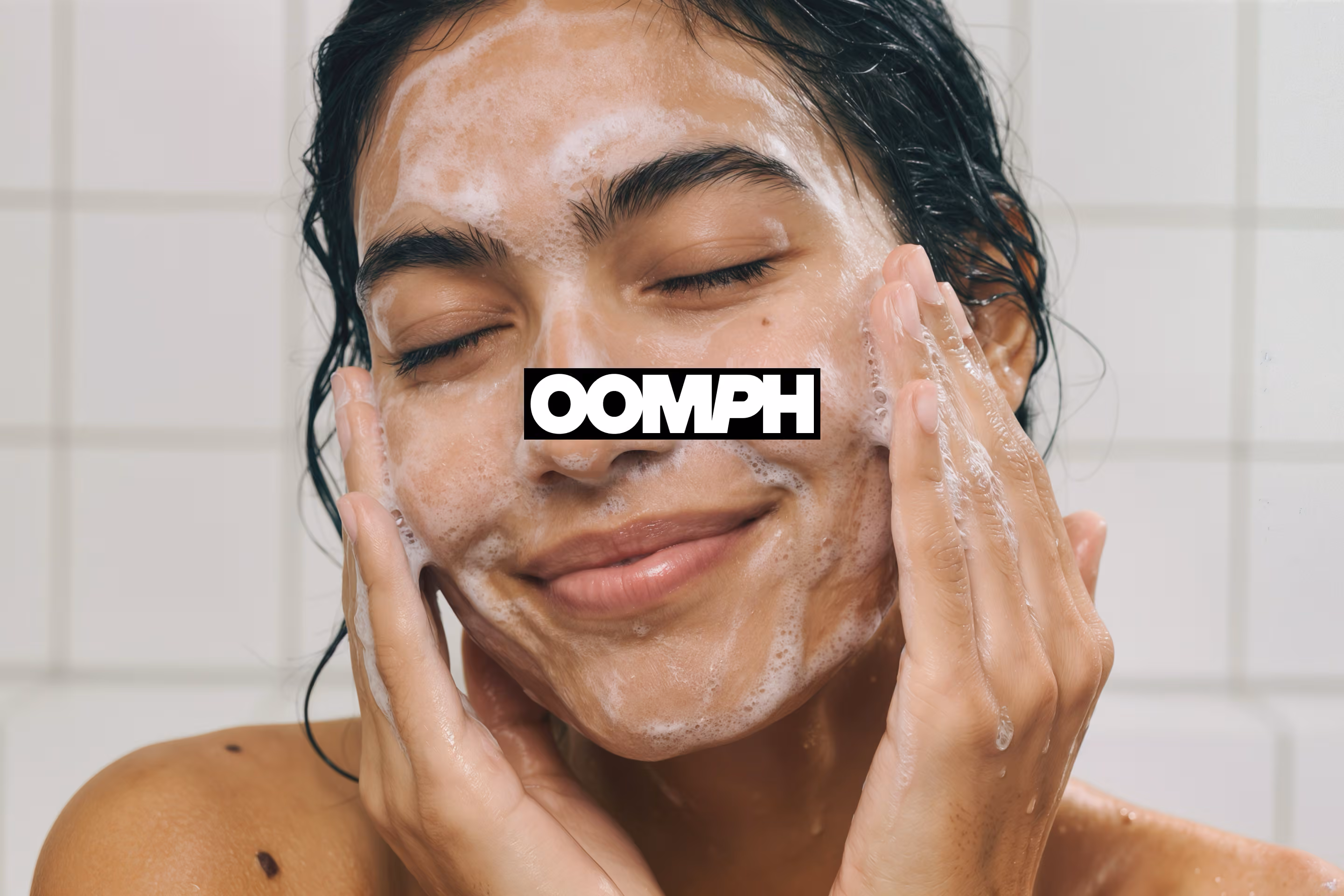
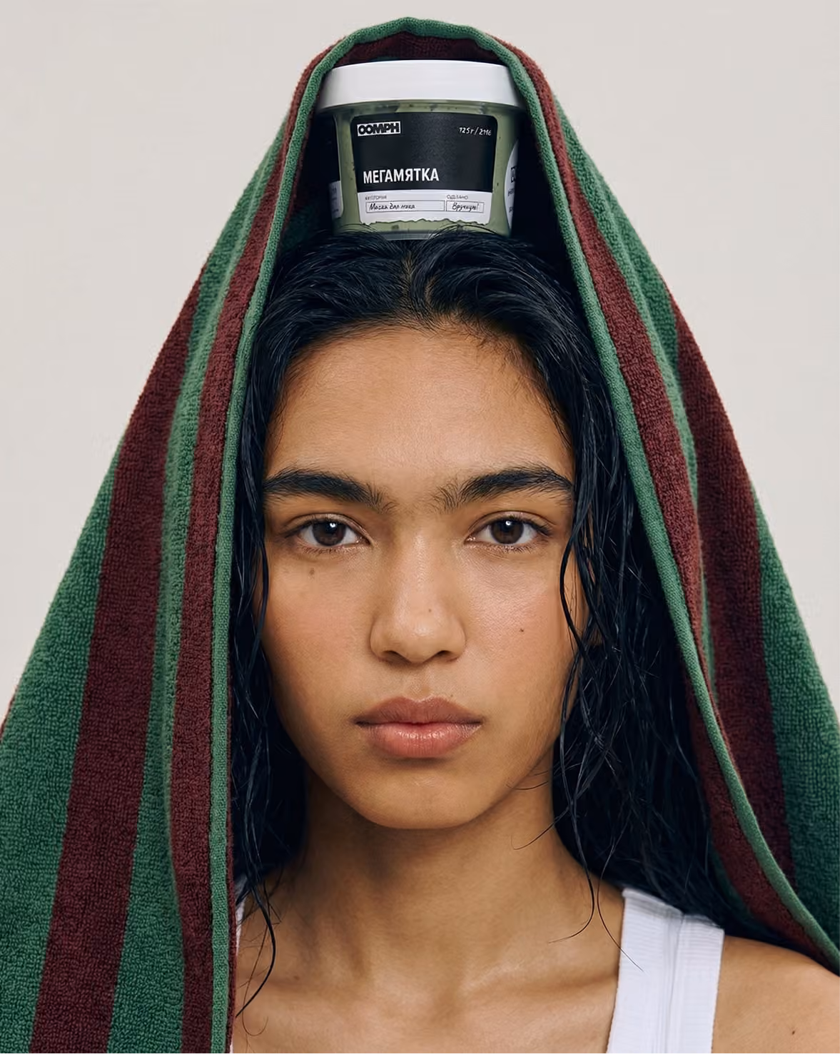
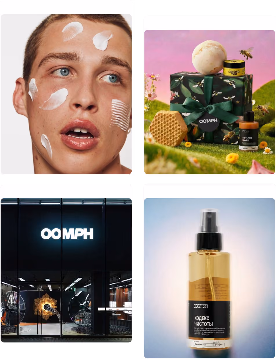
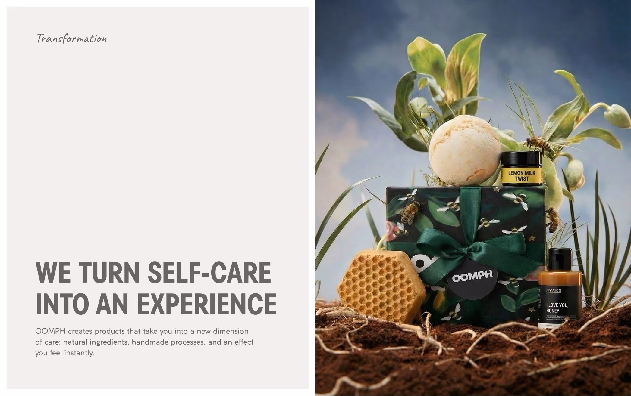
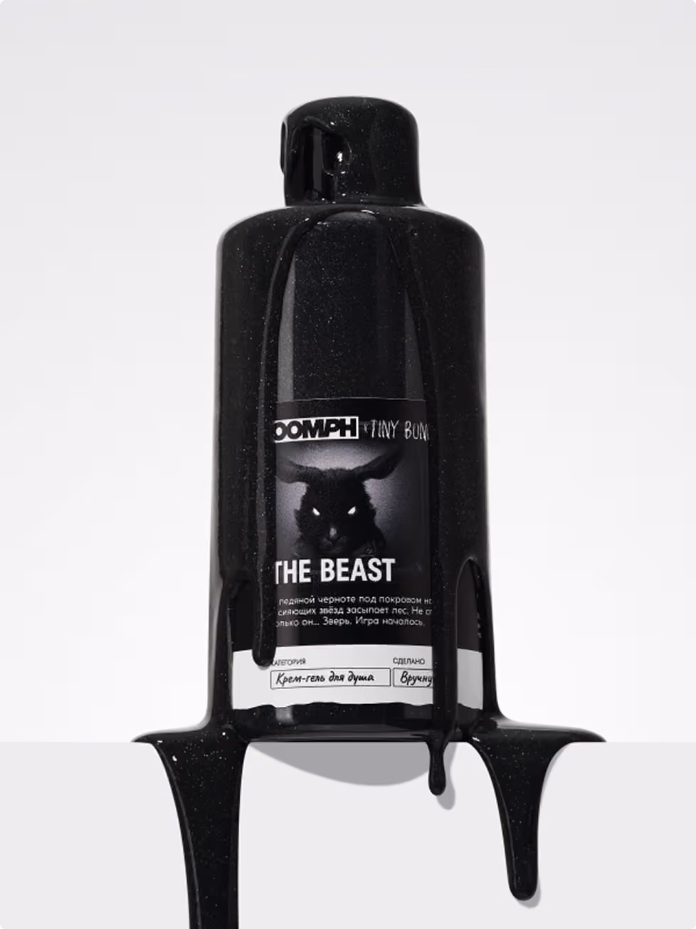
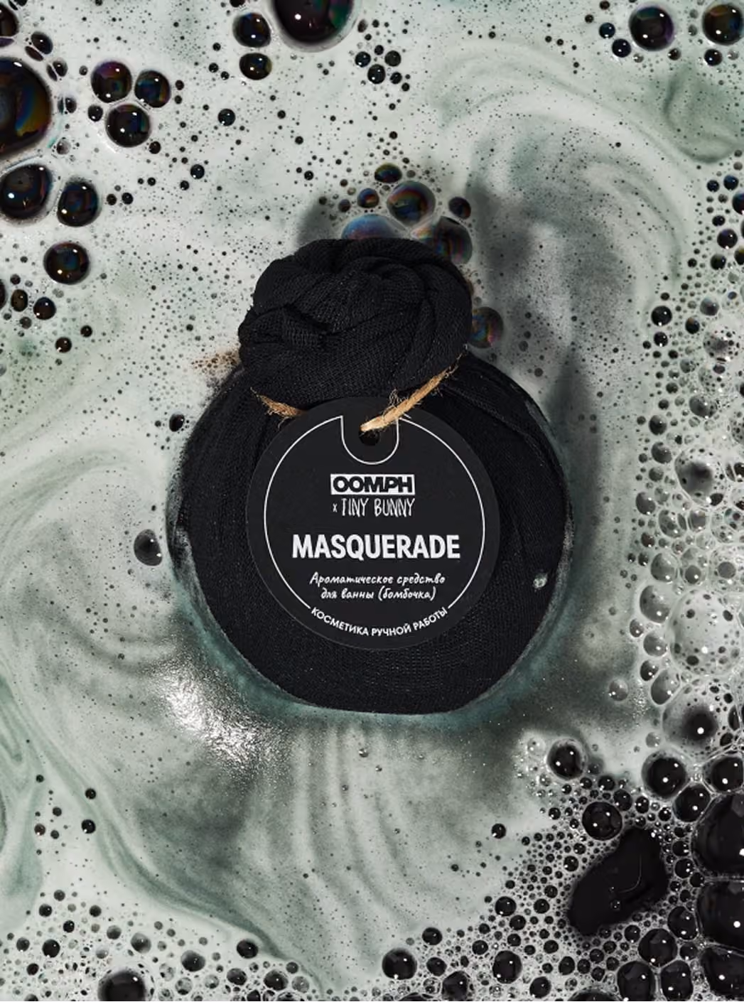
OOMPH is a bold handmade cosmetics brand built around natural formulas, fresh ingredients, expressive textures, vivid colors, and strong sensory experience. The project included brand strategy, brand platform, visual identity, logo design, packaging system, product labeling, showroom navigation, campaign direction, and retail communication. After LUSH left the market, OOMPH continued working with a strong product foundation rooted in handmade production, ingredient quality, color, scent, and tactile richness. The rebranding focused on making the product itself the main visual asset, avoiding generic “green” design and building a more confident, distinctive, and recognizable brand system.
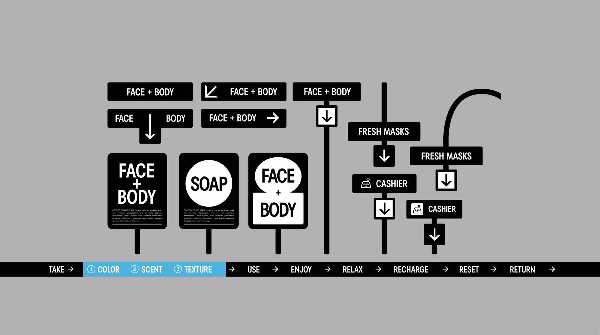
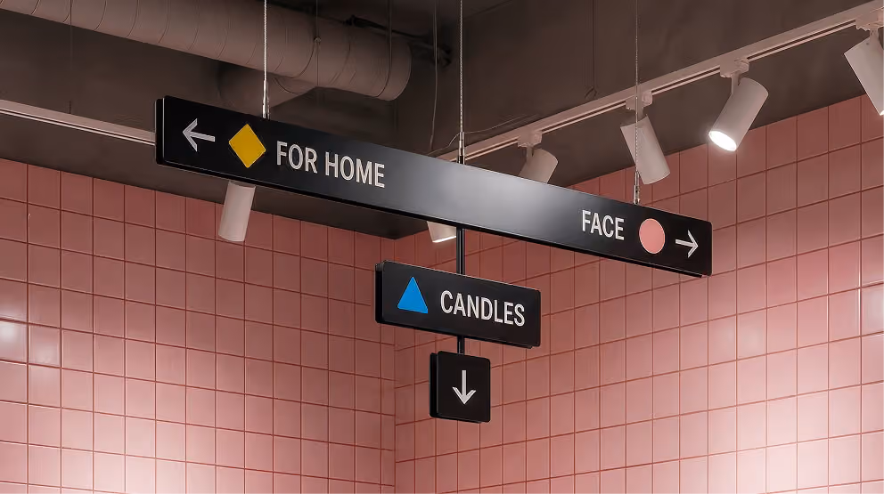
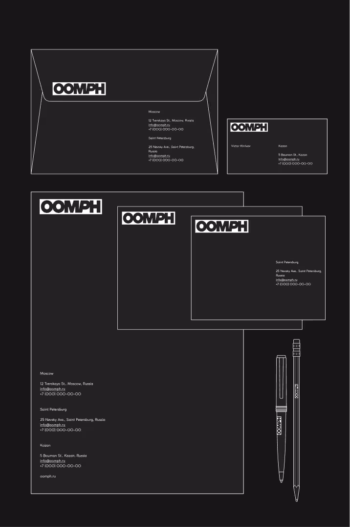
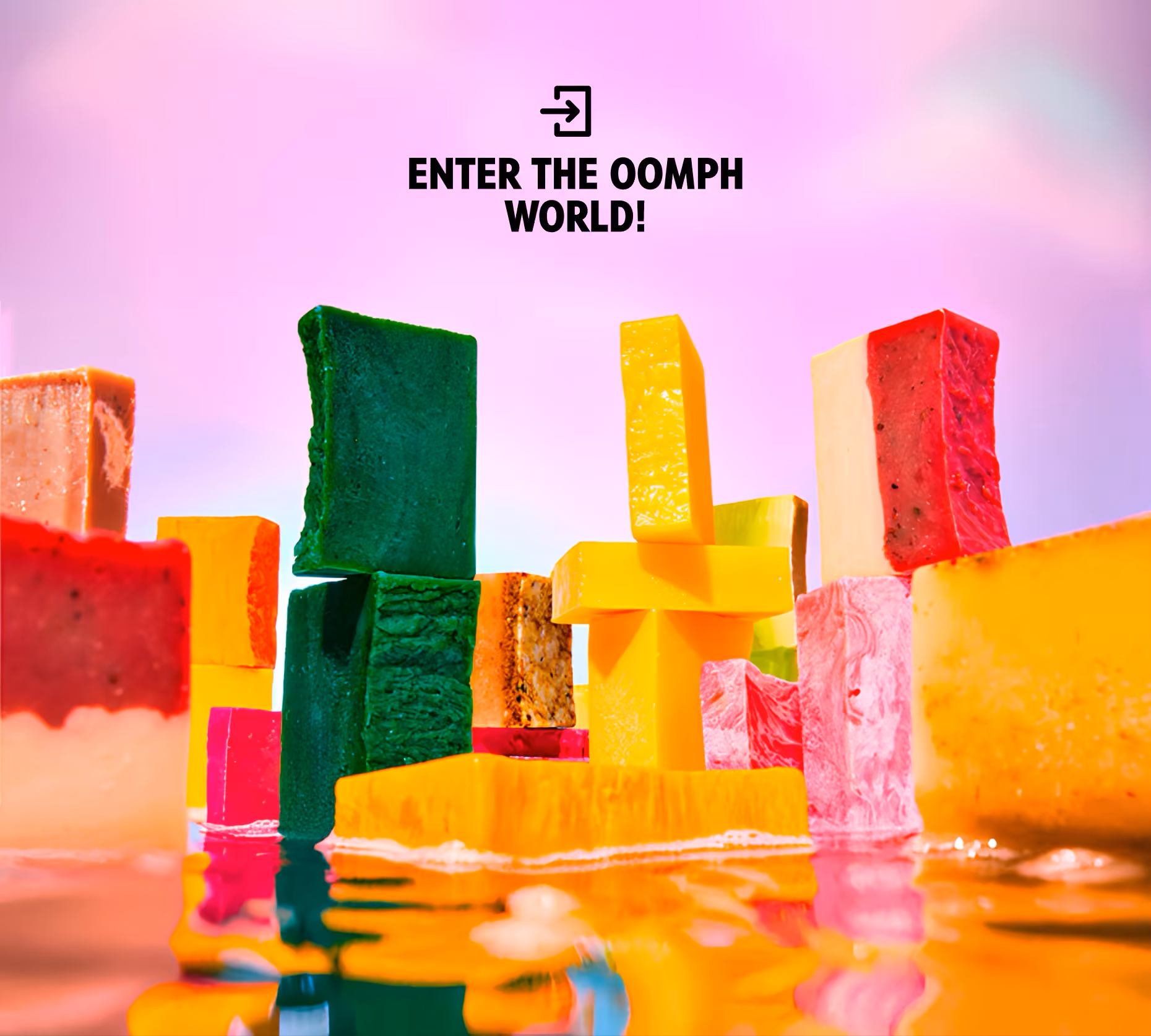
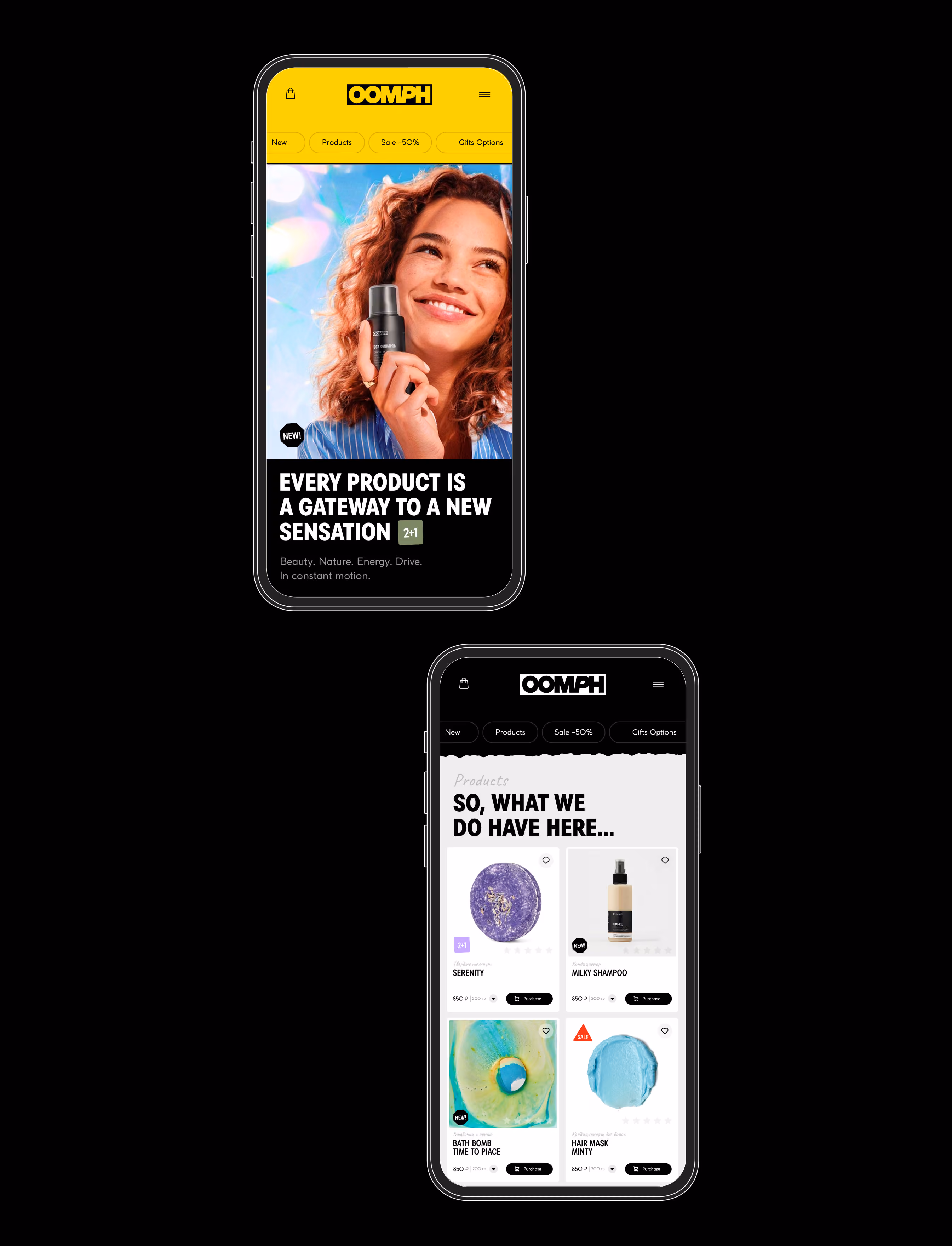
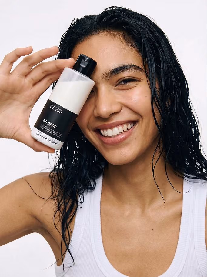
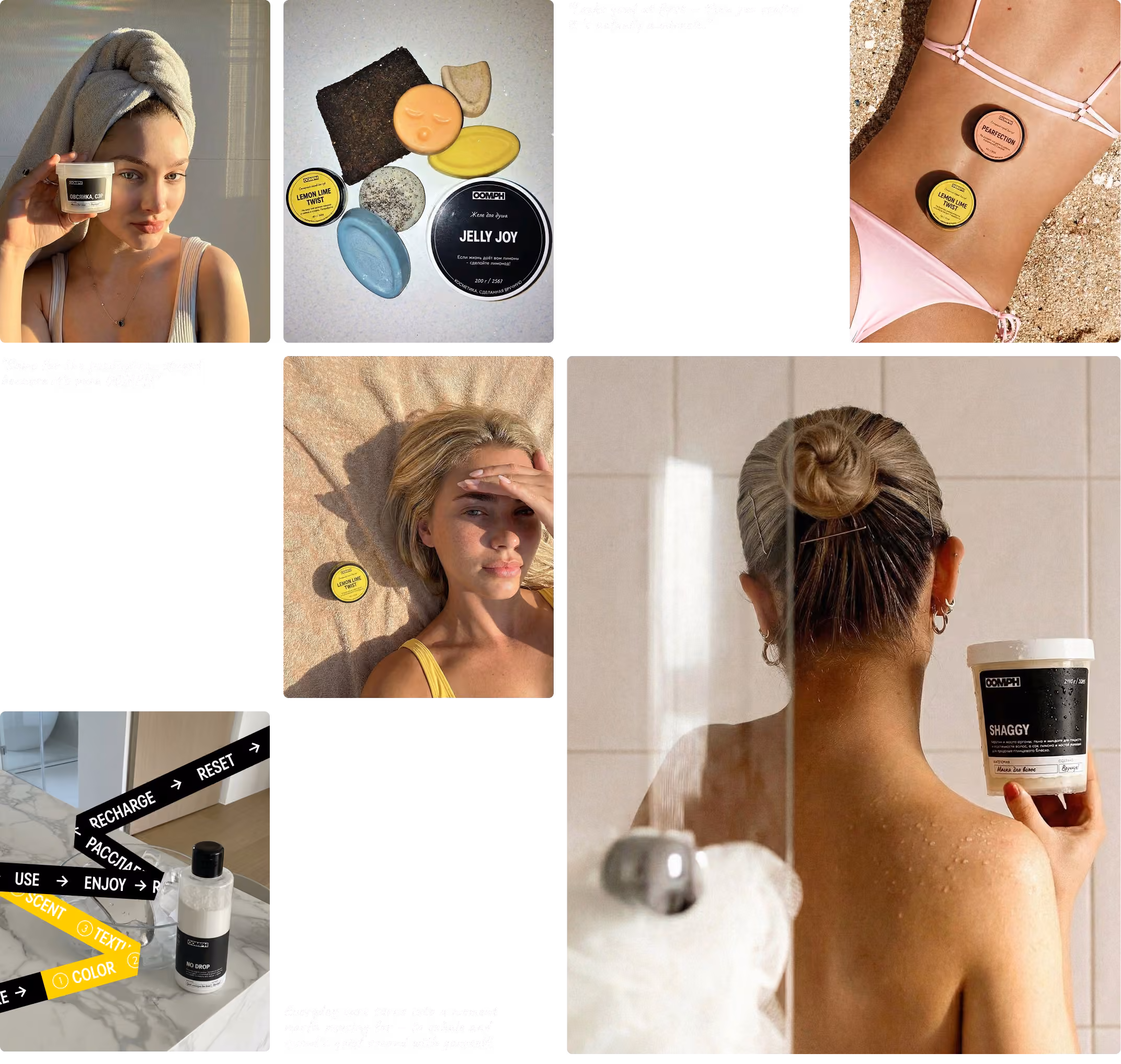
The identity uses a dense grotesque logo, bold typography, black packaging, transparent product windows, hand-marking details, and a flexible labeling system that works across product lines, limited editions, collaborations, retail spaces, and immersive showroom formats. OOMPH is positioned as a handmade cosmetics brand where product, packaging, space, and campaigns work together as one sensory ecosystem. The brand speaks through texture, aroma, color, tactility, product rituals, user-generated content, and physical points of immersion, turning cosmetics into a vivid everyday experience rather than a purely functional product.